Blog • Insights
Evolving the Nation's Report Card – NAEP 2015 Reports
For a while now, I have been telling the story of our work on the digital reports for results from the National Assessment for Educational Progress (NAEP) program, work we do alongside Educational Testing Services (ETS), the NAEP team at the National Center for Education Statistics, and other partner organizations. Since starting the work in 2013, we have been collectively evolving the reports forward to increase their effectiveness and impact. But with the release of the 2015 reports for mathematics and reading for grades 4 and 8 as well as grade 12, our work in usability testing and data visualization pattern development reached a new level in recent months. There are many changes, but I’d like to give insight into a few key design decisions that helped these reports achieve success.
Consciously Use Brand Colors, Especially With Highly-Interactive, Data-Heavy Properties
One issue one might notice while reviewing the NAEP reports is that they look nothing alike. Compare a 2013 mathematics and reading one to the 2014 U.S. history, civics, and geography one, for instance. The 2015 reports introduce yet another visual design, but this design is the end for now, as NAEP has now reestablished branding standards.
The updated branding guidelines handed us new colors to use in designing the reports, but what is critical to note is that we did not just use a dab of blue here and a swath of gold there, and so forth, wherever they happened to look nice. To create a cohesive, usable experience, especially given the significant interactivity and robust amount of data, we developed clear, consistent uses for colors and the elements that take them on. Color is part of the language of the site, not just decor.
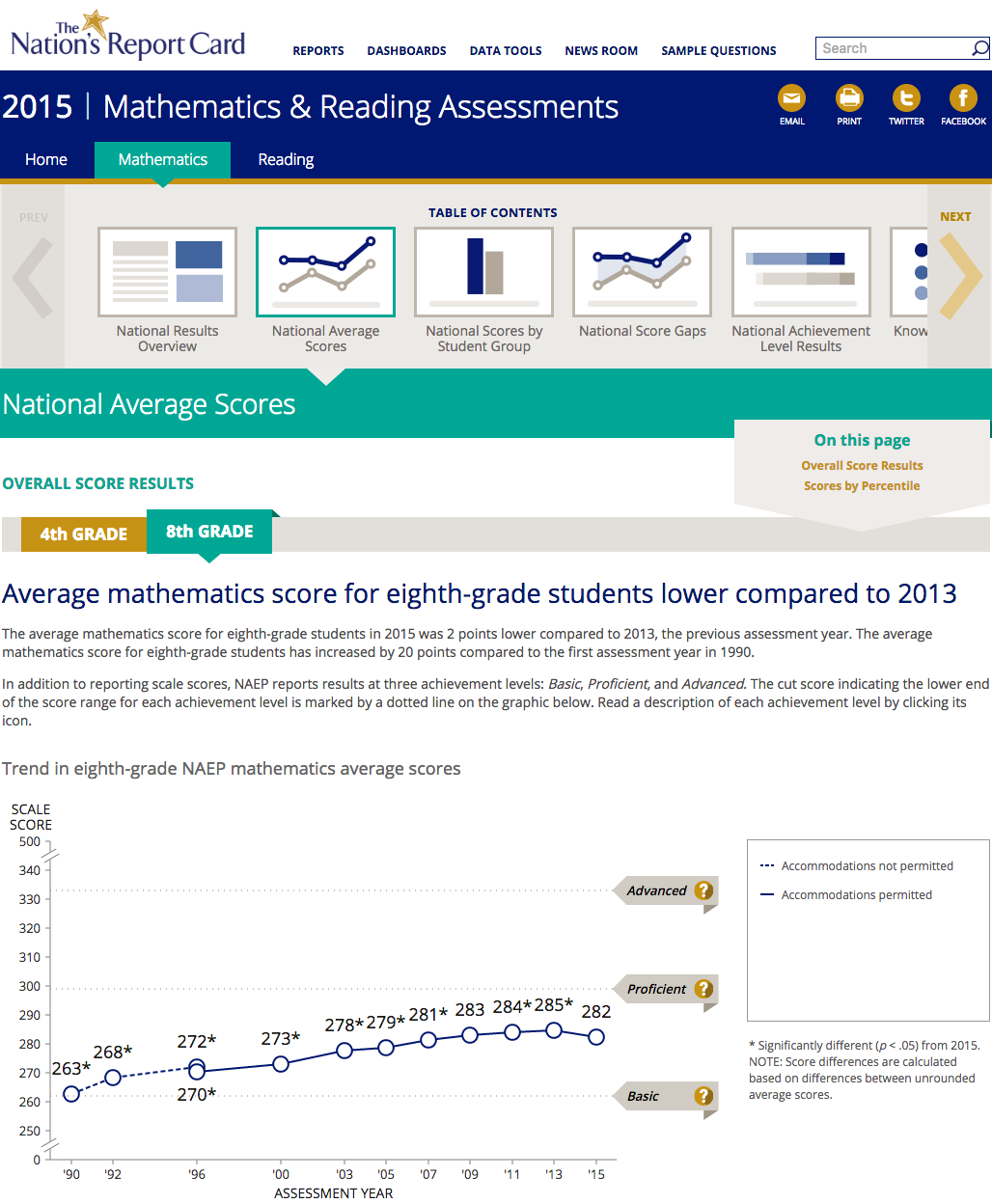
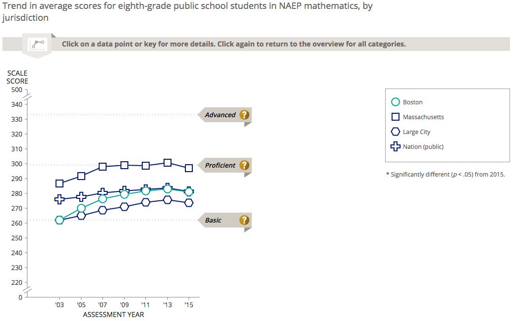
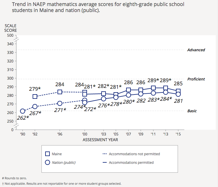
Consider the blue, one of the primary brand colors. We use it to anchor the header, yes, but it is also the base data color. As shown above, we use the blue alone for chart lines and points. Additionally, it is displayed in gradients in more detailed maps and charts, as shown below.
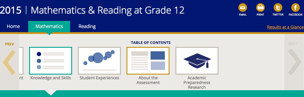
Look then at the turquoise, which is a secondary brand color. We have established it as the “focal” color. In first image displayed in this post, you are seeing 8th-grade results, so the grade selector has that grade in turquoise. The same is true for the selections in the navigation and the page title. In more complex charts, where comparison occurs, the turquoise represents the data point / set that is in focus, as in the case below with Boston’s performance against that of Massachusetts, all large cities, and the nation.
Finally, there is the gold, which is the other primary brand color NAEP has established. Gold is used, always and exclusively, for action items. In the first screenshot above, notice that the links are gold, the control to show 4th grade is gold, and the more info “?” symbols are gold. All represent actions one can take. Looking around the site, you will see it used for buttons, drop-downs, and so on. This consistency, combined with good labelling, allows users to understand what they can and cannot control at a glance, once they begin to interact with the site.
Establish Clear Patterns for Key Interface Elements
This next point follows on the one from above: while color sets a clear language for the interface, other elements do to, such as styles of navigation, types of controls, displays of data, and so on. We try to maintain a standard of using clear, reusable ways of displaying or controlling a given item — patterns — both within and across reports. Many began in prior reports, but we made an explicit effort to migrate them to the new design, update to fit as needed, and use them again.
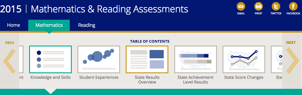
For instance, we use the same navigation scheme pattern for both the grades 4 and 8 report and the grade 12 one, even though the items within each differ.
The same is true on charts. See how a more detailed chart showing state score trends uses the core elements of the basic national score trend chart from above.
Patterns provide a set of common touch-points for users during their experience. By starting with simple ones and then growing complexity, we enable users to incrementally learn more about the data and have proper expectations about what they will see and what they can do. They are critical tools for taming a complex user interface.
Of course, sometimes patterns can and should be broken, but that’s a different post.
On Overview Pages, Balance Summary Insights with Paths Deeper Into the Content
Landing pages and other overview pages can present a quandary. You want to give audiences enough information to draw them in but not enough to eliminate their incentive to dig deeper. You also want to keep this initial experience as clean as possible while also providing a number of paths into deeper content from the page itself.
We have been trying to walk this line on each NAEP report, with different degrees of success, but the Grade 12 report seems to have produced a nice model. We focused the landing page on a smaller set of richer infographics, connecting each to deeper content in different ways.
To be sure, we still saw some limitations, with far less traffic to deeper pages than we would like. In the case of this report, additional subject-specific overview pages may add an additional barrier. In some cases, the basic information on the homepage may be all that certain audiences need. We will be exploring this further with subsequent reports.
Use Usability Testing to Refine Data Visualizations
I have said it before, but usability testing is a valuable tool not only for checking large information architecture decisions like navigation and labelling but also for nuances of data visualization display.
For this report, we used usability testing to validate two charts we had been using and were unsure about: 1) achievement level stacked bars; and 2) an “item map” that places questions on the score range based on the associated student performance. Both, in fact, performed relatively well in tests. The audience members with whom we tested could read the charts and gather prescribed information from them. In general, these target users also found the charts useful.
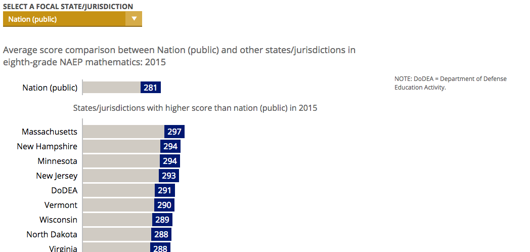
We also used usability testing to confirm some issues with other charts, particularly in the state and district sections. In the chart below, for example, users missed that the nation was the default focal jurisdiction and that all other states were compared to it. We will be making a fix that — returning to deliberate use of color here — leverages the turquoise to make the focal jurisdiction stand out more.
In this case and others, the value of the testing is enormous. We find issues that cause large usability problems but are relatively simple to fix, technically. We find that we really can’t do enough usability testing.
For more info on design centered around your users, stay tuned for future posts on data visualization, user experience design, and more NAEP reports updates!