Blog • Insights
Design Lessons from a New NAEP Results Report
These interesting and, in some cases, counterintuitive findings show the importance of the NAEP assessments and give those making education policy decisions valuable data as they plan how to better build capacity in science, technology, engineering, and math (STEM) fields.
As a key partner with Educational Testing Services (ETS) and the NAEP team at the National Center for Education Statistics, among others, Forum One helped to tell the story of the TEL assessment by helping design and build the digital report of the unique test and its results. As I reflected on the report, I found several useful lessons others can take away from it.
Patterns Are Great, but the Content Rules
This may seem a trivial point, but it is easy to forget, especially when creating a series of sites, that you need to stop and look at the stories and unique content in a given case and create navigation optimized for them. On other NAEP reports, such as the 2015 Mathematics & Reading report, we organized the content by subject and then by jurisdictional level (national, state, and select districts). This is a pattern we had established over a few reports and allowed for exploration of many results in a logical, flowing way.
Using this pattern for TEL, however, would have been a poor idea, and not because there was just one subject, only national results, and but a single grade. TEL was a special report, and that was as much of the story as the results. The navigation and controls needed to reflect this uniqueness, and, while we leveraged some existing patterns, we also introduced new ones to fit the immediate needs.
How was TEL different, and why was this important? The most obvious uniqueness is that the TEL assessment had never been given before. There was, therefore, no historical data to show much less any trends. We had results, but, absent as much larger context as there is in longer-term assessments, we couldn’t analyze them in as much depth.
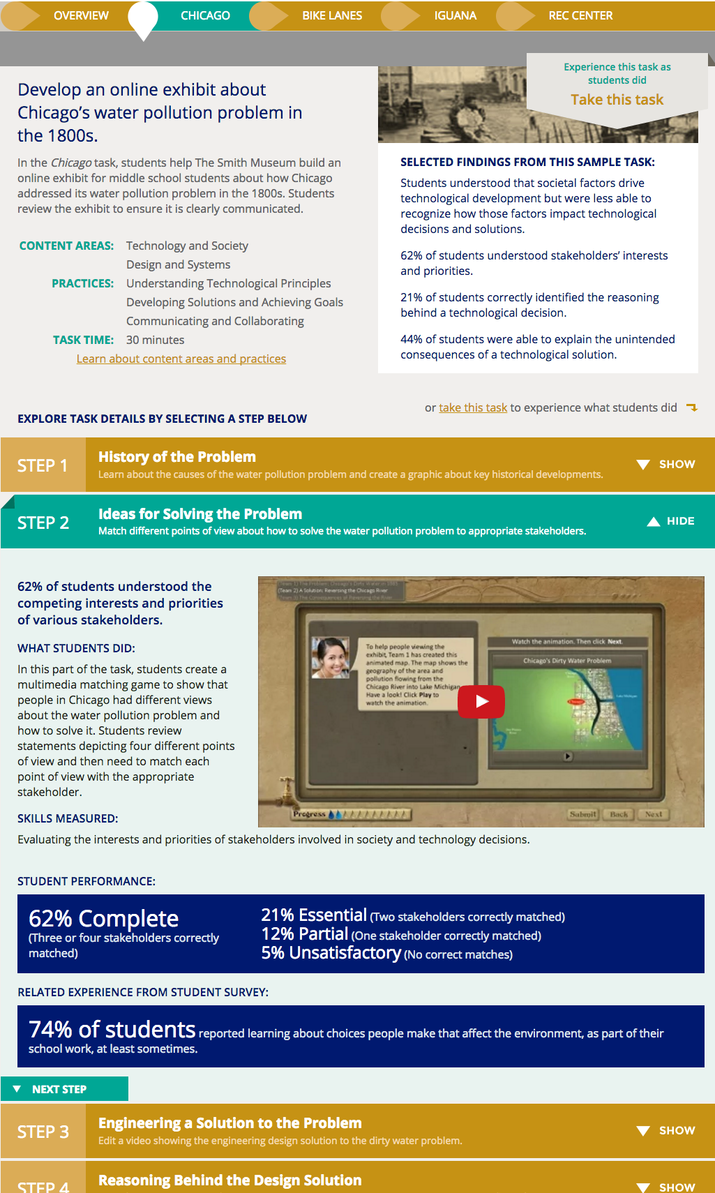
More importantly, though, the TEL assessment was delivered via laptops using a series of interactive, scenario-based tasks. Students watched videos, listened to audio clips, and used other like elements to complete the tasks, showing they could solve various types of technology and engineering tasks “in practice.” While there were also some classic discrete questions, on the whole, the assessment was quite different from the pencil-and-bubbles tests that have been the standard. It is the innovative mode of the assessment that we wanted to highlight almost as much as the results.
To these ends, the report’s navigation concentrates the main results into one section and highlights the sample tasks in one of their own. Within this structure, we maintain key design elements to orient users: our use of color is consistent with other reports, we use many common controls, and we maintain the use of some familiar charts. These elements still serve the story of the TEL report, so we carefully held onto them.

Showing the tasks, though, required a way to break down the complex scenarios into component parts, each with explanatory text, a video, and some sample results. We introduced an accordion element as a way to show the overall task structure and allow diving into the components. We found this new pattern also worked for other sections, and thus it became a major control introduced in this report.
Deep Content Can Yield High Engagement
The result of the design is that there are relatively few individual pages—as the user notices them—but those that are there are deep with content. During some initial usability testing, we found that users seemed interested in the content and were generally able to navigate it (see more on this below). This gave us hope, but we were curious to see how a broader set of actual users would engage with the report.
Google Analytics provided answers. The topic being relatively esoteric, we did not see large numbers of sessions or page views. Those that did come, however, were spending significant time on some pages:
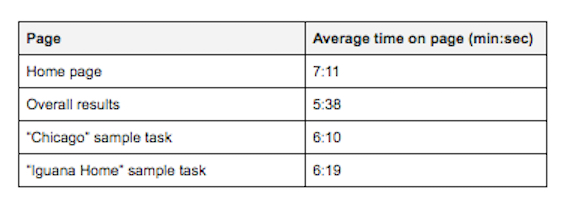
The numbers during the first days after launch were even higher. These were high numbers suggesting that those who did come to the site were exploring it to a notable extent. We didn’t have in-page analytics, but we could assume that they were opening some accordions and learning more. We also saw 1.6 pages per session, further suggesting some number of users were making their way around the site to some extent.
From the numbers, we cautiously can conclude that deep, interesting content such as that in this report will get explored if audiences can find it and easily access it.
There Are Limitations to This Deep Interest
We did find, as well, that there may be a limit to how much interested users can even digest. We placed four sample tasks on the site. Two, as noted above, got extensive use, and a third saw decent traffic. These happened to the the first three, reading left to right. That fourth one, though, is a bit of an also-ran on the same measures. In retrospect, three tasks were plenty.
Likewise, the sections farther to the right in the main navigation saw less usage. There may be different reasons for this—less interesting to users or less clear purpose—but it seems reasonable to conclude that part of the problem may have been that there were simply too many after some already deep sections.
One addendum here is worth mentioning. The report has audiences internal to the NAEP team. Even if others have not used some of the later sections as much, they have been valuable for these internal audiences, and this is a valuable constituency. Analytics is critical, but you have to make sure there isn’t important context underneath the raw numbers.
Content in Other Media Can Be Complementary
One surprising result we have seen from both the TEL report and from the Mathematics and Reading at Grade 12 report that launched in April is that additional products related to the report can actually enhance site usage, not take away from it. In the case of the TEL report, there are three PDF-based infographics that one can download from the report site. I feared they would cannibalize report traffic, meaning that some set of users would grab them quickly and go away, never to return. The opposite appears to the the case. Those who downloaded at least one of these products represented a modest percentage of site users, but they had much higher average times on page than the non-downloaders, around ten minutes versus more than six and a half minutes. The downloadable products complemented heavy usage. Perhaps they provoked deeper questions, or perhaps they were a nice takeaway for those who had already browsed a considerable amount. Regardless, the positive effect is clear.
There was also an introductory video on the site that NAEP promoted via social media and YouTube. It was picked up by a media outlet, which ultimately drove good traffic. Here again, products in different media helped each other.
In Case You Missed It, Leverage Usability Testing and Analytics
We were able to find important insights about the TEL report from both usability testing and Google Analytics. We were able to do testing during the development phase, which enabled us to make improvements before launch. Did we find we needed to make drastic changes? No. In fact, what we changed was modest in terms of development time but likely important in terms of user experience. We added a better label to the accordions and increased their link targets. We rearranged and reformatted explanatory text in the task descriptions. We tweaked language around the results. None of these was a big lift and none threw off the schedule, but all were well worth doing.
Analytics, as I describe above, gives us insight mostly for future reports—since NAEP reports tend to stand as they are after release—but you can see the insight is powerful. We will be better able to understand where to place efforts in future reports as well as how to further enhance the work we do. Being able to understand what users did—via analytics—and why they did it—via usability testing—is critical for a major design effort.