Peace Corps
Increasing Participation in Essential Development Activities
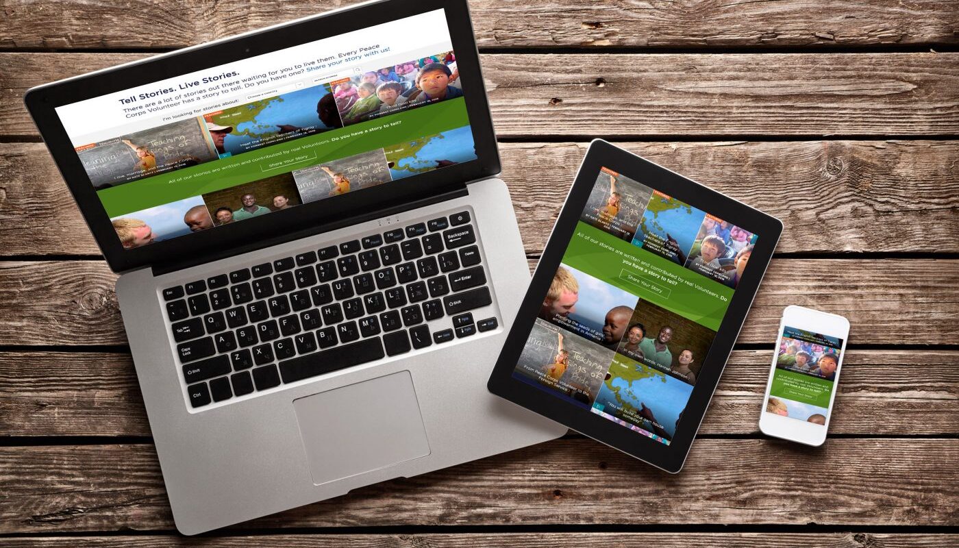
Peace Corps is dedicated to Volunteer service, sending Americans abroad to tackle the most pressing challenges around the world. Peace Corps Volunteers are invited by host countries and work at the grassroots level to create change that lasts long after their service. They go where they’re needed, and they “bring the world home.”
Potential Volunteers rely on the Peace Corps website to gather information about volunteering and ultimately apply. Peace Corps received nearly 23,000 applications in 2015 with nearly 7,000 Volunteers currently serving in more than 60 countries.
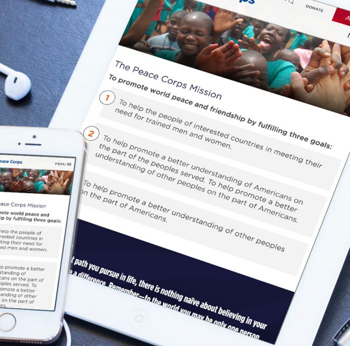
Peace Corps launched a refreshed brand platform, including an updated logo and new visual identity to take a modern, digitally-focused approach to engage the next generation of Volunteers. As part of this extensive brand refresh, Forum One redesigned the website with an emphasis on putting the user first.
Discovering More Through Collaboration
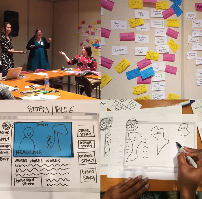
From the outset, we understood that the Peace Corps website meant a lot to the people within the organization and the many different stakeholders they represent. Forum One felt it was important to understand all of the different needs and interests as part of the development. We devised and led a series of in-person workshops to prioritize audiences, understand internal and external needs, and most importantly, hear everyone’s voice.
Internally, we understood equally well that this would be a big, big project, and that a collaborative effort was vital to ensuring we were on the same page from start to finish. We therefore staffed our team with a number of creative-minded folks, all with different strengths—from user experience to content strategy to visual design. Coupled with regular, in-depth co-working sessions with the client team, we set our team up for success from the beginning.
We worked with Forum One to design and build a site that takes into account our business objectives and stakeholder input but did so through the lens of the user. Forum One focused on developing strategies for communicating information without compromising the user experience. We were always asking, ‘how do we make the website meet the users’ needs on their terms?
Kelley Gallagher & Bryan Williams, Co-leads for Website Overhall, Peace Corps
Getting a Jump on Content Strategy
For a website with more than 13,000 pages (and even more files), we knew we couldn’t let content get away from us or leave it for the last minute. Before starting designs, we developed extensive content inventories and audits for all site content, giving our client team a starting point to understand what was on their site (and what might not need to be).
Once we defined our new website structure, we built out each new page in a content staging tool called GatherContent. Together with Peace Corps, we assigned each page to a specific content creator, and the entire team (nearly 100 creators!) developed, reviewed, and approved all pages with the help of custom workflows our team developed. This way, Peace Corps had content prepared – including more than 900 pages of new content – ready to load into the CMS, which our partner, Excella, developed in Python/Django.


UX + Design = <3
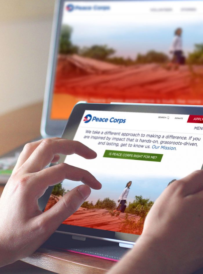
How better to start a new website design than with the structures that hold it in place? Alongside Peace Corps, Forum One’s UX and Creative teams joined forces to restructure the Peace Corps website, focusing on areas like volunteering, countries where volunteers serve, and stories about real-life Peace Corps experiences.
After sketching page designs and forming a holistic understanding of each page’s purpose, both UX and Creative developed a strategy for a cohesive design and messaging framework to provide a consistent, thoughtful experience across the website. We took a modular approach with the structure of the pages and design system, creating flexible and reusable elements that could be applied to pages across the site. This system resulted in a consistent design that is also flexible enough to extend to new pages in the future.