Blog Insights
Visual Literacy: A Picture is Worth a Thousand Words
I recently attended a webinar put on by the Communications Network focusing on the power of imagery. Carolina Kroon, a photographer, videographer, and activist led the webinar and helped to break down how an organization can more strategically use their images to reinforce their messaging, branding, and communications.
But first, what is visual literacy?
Visual literacy is the ability to recognize and understand ideas conveyed through visible actions or images. This means that you don’t even need accompanying text to understand the meaning or feeling of what is being portrayed. When asked why this is so important, Koons replied: “Because of the separation of the text from it. It’s purely visual.”
Visual literacy and the brain
Images are so imperative to design because we process images unconsciously at a speed 60,000 times faster than text. Attention spans are increasingly decreasing, so meaning needs to be conveyed faster and more accurately.
On the average day we see around 5,000 images. Consideration should be put into which outlet you want your images viewed on. Your Instagram audience may be different from your newsletter audience. Use analytics to make the most of all your platforms while customizing for each audience.
The human brain remembers 80% of what it sees but only 20% of what it reads, so that means your audience remembers 80% of what they see. At 80%, visuals are indisputably one of the strongest tools you can use to communicate your message, but only as long as you’re using the right ones.
How much faster does your brain work processing text versus images?
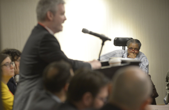
First read this: Man in a suit with a purple tie, glasses, and a suit is at a podium speaking into a microphone with a screen projection of himself behind him that has the focus of the image.
Now look at the image below. The speed in which you’re able to absorb the same information as the blurb above should be noticeable.

The brain process images 60,000 times faster than text.
Implied narratives
Here are two images Koons provided in the webinar. Look at the images and ask yourself, “what is the difference in narrative these two images portray?”

Most folks in the chat box responded similarly to me: white savior vs. community sustainability. There are implied narratives in the images your organization chooses to use. Koons challenged us by raising an alternate scenario which reversed the way one might perceive the image: the person holding the grain on the left is indeed a member of the community and the person on the right is said savior. Even then, the webinar attendees already had their narrative too deeply-ingrained based on the position of the hands. On the left, the pair of hands holding grain is probably 6-12 inches above the group of hands, while on the right, the hands holding grain are resting within the group, touching the hands to the left and right of them. We see that, and then comes the implied narrative. There are narratives within images, so make sure they’re the right ones.
Stories
Typically, the order in which content is created goes: copy comes first, then images are selected or created to support it. But there’s an even better way and that is to create stories or content in collaboration with visuals.
Consider the image below. What story does it tell you? Perhaps something along the lines of: There is a man speaking at a board meeting and the person in glasses to the right is not picking up what he’s putting down.

That story might change if the man at the podium was in focus and the person in glasses was out of focus. Then maybe the story could be, “the man at the podium is presenting riveting information to his audience.” The following are things to consider while creating images to accompany stories are:
- What is the focal point?
- What is taking up majority of frame?
- Does the story change if someone is seated versus standing?
- Where does the light guide your eye?
The problem with stock photos
Increasingly, organizations are moving away from stock photography. If your mission is unique, then one size fits all photography is not going to hit the mark. Your photography should say something about the issues you’re tackling. Generic images can portray an undesired message. Budgets needs to be taken into account, however if you can get exactly what you want out of a photographer, then it’s worth it to build your identity and brand. Clarity can yield great results. Look at the long-term vision of impact and how your organization wants to be seen.
Style Guides
Style guides make your brand and strategy more effective and efficient. Every organization needs one. Having a style guide is good for your staff and for your creative team to make sure everyone is working with the same vision in mind. Look to your creative team to guide you with imagery selection in order to make sure what you’re putting out effectively represents your organization.
Koons conducted a number of surveys during the webinar. Here are some of the results:
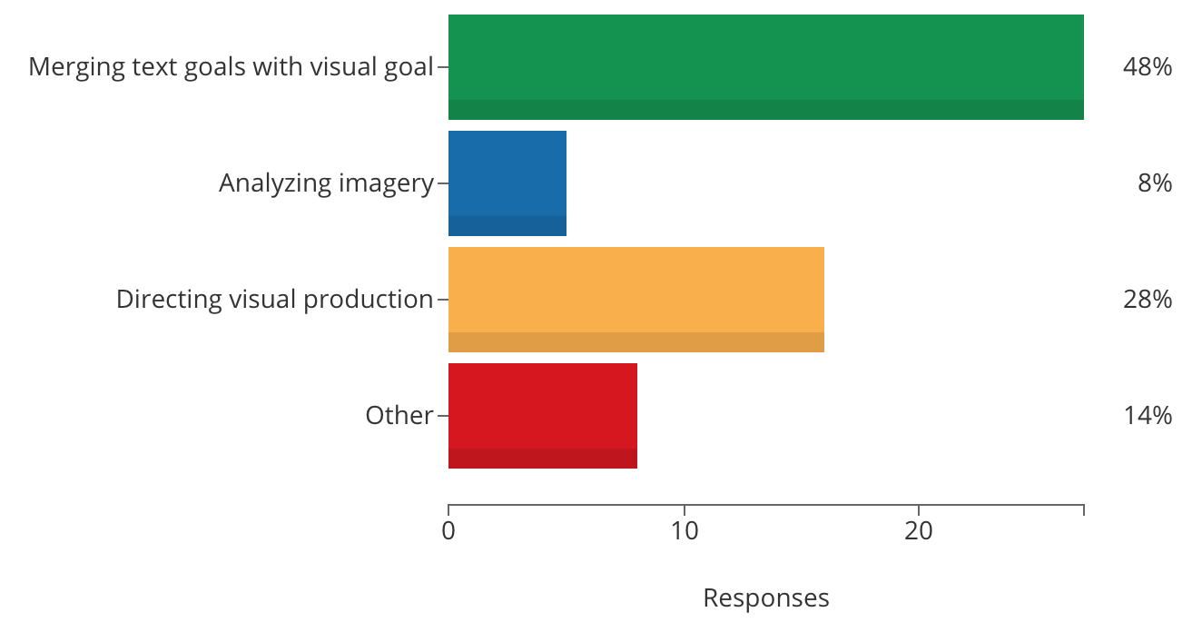
What is the most challenging aspect for you in the visual literacy arena?

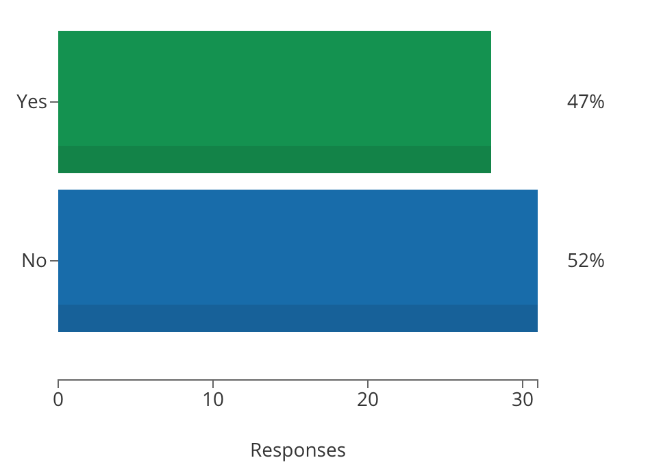
Do you have visual strategy as part of the organization’s communication strategy?

48% of organizations who participated in the webinar are having challenges merging text goals with visual goals. 52% don’t have any visual strategy as part of their communications strategy. That’s where a style guide comes in. A style guide should include a photo section to provide deliberate and thoughtful guidelines.
Key Takeaways
Some great insights provided by Koons:
- What are you asking your audience to process cognitively?
- Analyse everything your visuals are saying.
- What, who, how, when, and why are you representing in your visuals?
- Create a visual strategy or guide!
- Have FUN!