Blog • Insights
Think Bigger: Design Your Mission-Driven Service Delivery
If you work in government, you’re providing a service. If you engage with people who support your nonprofit or welcome visitors to a national park, you’re providing a service. And it’s very likely that the people you’re providing a service to have interacted with one of your digital properties — such as your website or social media handles — to get information, learn more, and connect with you.
How service delivery is translated across your digital properties is paramount to your mission’s success. Technology can be used to extend the arm of a service, but if not done right, it can also hinder it.
This is where design comes in! Design plays an important role in designing service delivery to ensure that every touchpoint you have with your target audience builds on their trust in your organization.
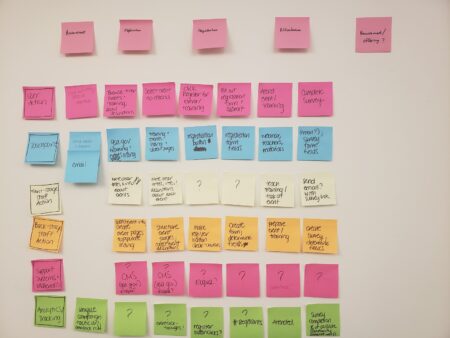
 To fill in the blueprint, begin by working (in-person) with a select team of people from your organization who are very familiar with your digital properties. Use sticky notes to map out the blueprint. Below is an example that I worked on recently with my team, where we mapped out how someone moves from awareness of an organization’s service, through connecting with a representative and then entering the pipeline to use the service.

 Once you feel like you have a good representation of the current delivery, optionally, you can pull in additional stakeholders from your organization to confirm certain elements. After that, translate the sticky notes into a digital blueprint that’s easy to share with your team. This will also help to socialize it within your organization.
Service delivery: the current state of play
The reality of today’s digital world is that organizations don’t simply have a website as their online footprint. Rather, they manage a mix of digital properties that their audiences use to engage with their services or products. Instead of just one touchpoint, there are many, and users expect a consistent and clear experience with and across each of these properties. As a designer, I am seeing is that as new needs and priorities arise, many organizations are choosing to add or create a new digital property to accommodate them — e.g., a new website section, additional social media accounts, or a dedicated subject-focused website. With the speed of tech growth, this usually means adhoc additions of digital properties without a holistic check on how they all fit together. What this means for your users is that they see and experience inconsistencies in design, content, messaging, and audience focus within and across your digital properties. I’m sure we can all think of a time when we’ve called customer service and been told something different from what appears on their website. These represent two different touchpoints (calling customer service versus reading a website) that need to be more aligned. We work with a number of organizations that have struggled with managing their digital properties in a consistent way. Addressing this issue often requires taking a step back to understand the current landscape of all service touchpoints.The solution: a service blueprint
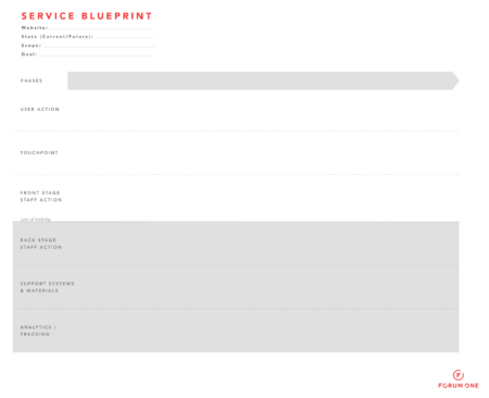
A service blueprint is a schematic that outlines all the steps of a user’s journey to complete a particular goal or task, and then lays out all the touchpoints, devices, people, and systems that users interact with at each step. The aim of a service blueprint is to help organizations to:- Understand the large breadth of interactions and support that are required to support the user journey.
- Identify ways to improve the user journey. The blueprint can illuminate where a user may experience inconsistencies or gaps in content or messaging. These problem areas then become opportunities for improvement.
- User action: The specific activities that the user is doing to move along their journey
- Touchpoint: The way that the user interacts with your organization
- Front stage staff action: The activity your organization’s staff is doing that directly interacts with the user
- Back stage staff action: The activity your organization’s staff is doing that the user does not see or directly experience
- Support systems & materials: The systems that are necessary to support all the staff and user actions
- Analytics/tracking: The metrics your organization is tracking for each step of the user’s journey
 To fill in the blueprint, begin by working (in-person) with a select team of people from your organization who are very familiar with your digital properties. Use sticky notes to map out the blueprint. Below is an example that I worked on recently with my team, where we mapped out how someone moves from awareness of an organization’s service, through connecting with a representative and then entering the pipeline to use the service.

Data collection: a new angle to the blueprint
I recently worked on a strategic project for an organization that was looking to streamline and track their service delivery. A service blueprint helped me to (a) understand the initial situation better, and (b) conduct further discovery work to gather additional feedback on areas for improvement. Throughout the process, our user experience and analytics teams worked closely to create the service blueprint. And through this process, we chose to add a new row to capture the analytics and data collection at each step of the journey. This helped our partner understand what was currently being tracked, and what we want to additionally measure in the future to see successful delivery improvements. The organization was thrilled to see their service delivery mapped out in such a way because it clearly demonstrated where gaps and opportunities for improvement existed. It provided them with a clear roadmap for how to streamline their digital properties and therefore improve their service delivery.Key takeaways
- Map out all the stages that a user must take to engage with your organization. Use a service blueprint to do this!
- Don’t be afraid to add a row in your blueprint for analytics and tracking. This helps your team measure success from optimizations made to your service delivery.
- Work with your team to see how you might improve your current service delivery. Identifying and addressing gaps can improve the user experience.
Learn more about service design
- “Designing Services That Deliver” (Harvard Business Review)
- “Guide to Service Blueprinting” (Capital One)
- “Service Blueprints: Definition” (Nielsen Norman Group)