Blog • Insights
Shaping Online Experiences for Cultural Institutions
This blog post was co-written by Hannah Studen, BBA ‘21 at The College of William & Mary
Cultural institutions have solidified their place as an ongoing source of inspiration as they have quickly transferred and reinvented their online presence. Mandated closures and social distancing requirements have created the opportunity for cultural institutions to expand their online platforms and enhance the digital experience for visitors. Many cultural institutions have made substantial efforts to grow and improve their online user experience. Here are a few we’ve worked with recently

A bold physical and virtual monument: The National Museum of African American History and Culture
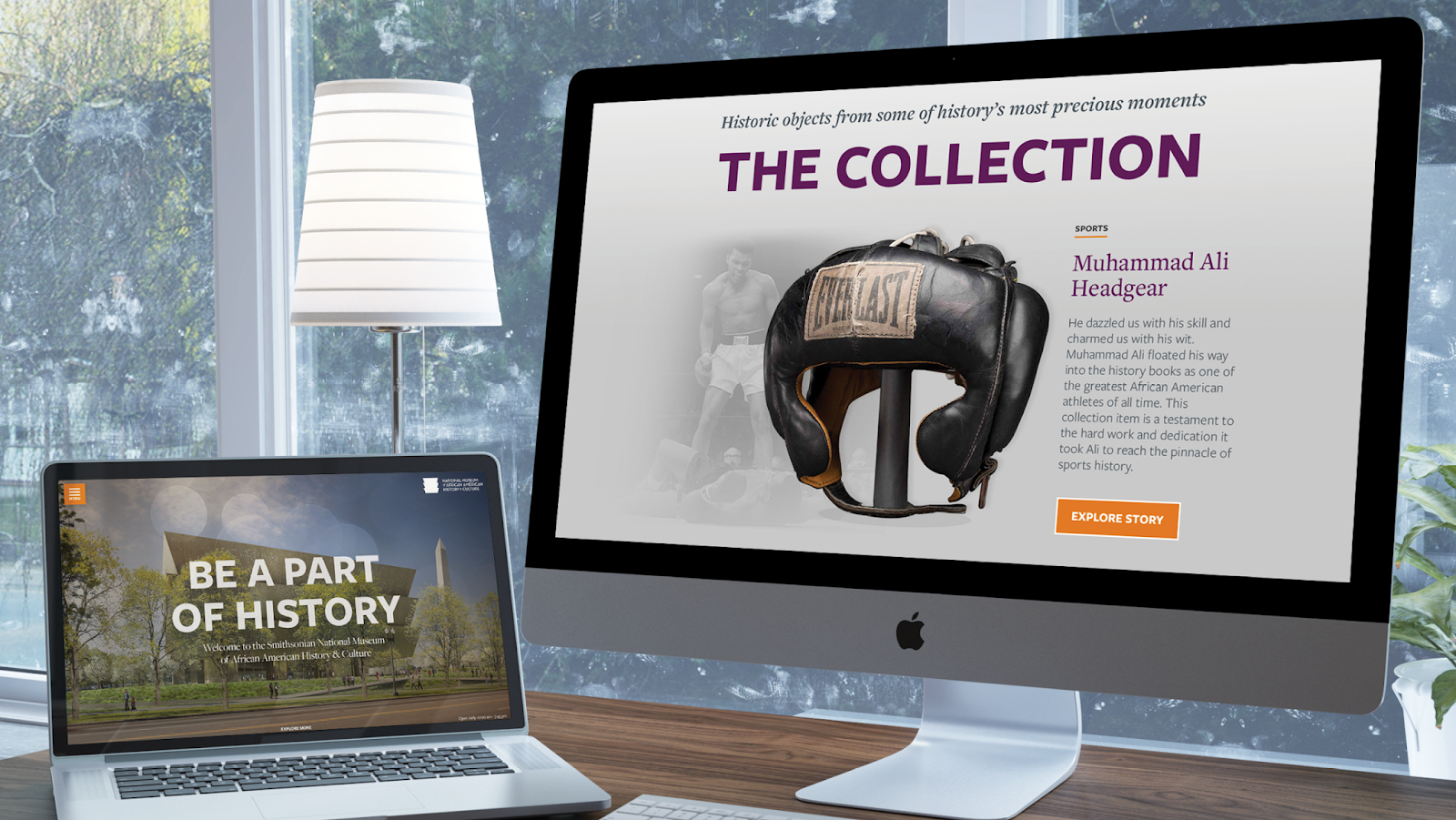
The Smithsonian’s National Museum of African American History and Culture website serves as a virtual monument to African American history. Even with closed doors, NMAAHC hopes to give all Americans a way to learn about the richness and diversity of the African American experience. The museum provides visitors with a lens into a story, and visitors are able to capture a similar experience online.
The website stands out with a bold visual presence that embodies its physical architecture – one that goes beyond simply providing visitor information to convey a powerful and immersive virtual experience. The website design features large-scale imagery that evokes its soaring spaces, then brings visitors up close to experience its collection.
The virtual museum serves a vital cultural role
NMAAHC’s website allows visitors to explore the NMAAHC through stunning visuals and an engaging content structure. The site provides numerous digital resources and opportunities for the user to learn and interact with museum exhibits through a 360-degree view of the exhibitions.. Before the museum opened and our team was working on their website, a primary goal was to ensure that visitors could make a virtual visit to the museum, even if they couldn’t visit in person.
A major element of the online experience is the Many Lenses Project, which shares stories about key parts of the NMAAHC collection from multiple angles as told by museum staff from NMAAHC, the National Museum of the American Indian, and the National Museum of American History. Many Lenses expands the museum’s digital storytelling approach, as it presents users with different perspectives to consider and discuss. The Curator Chats Series continues the online learning experience by providing video portraits of curators from NMAAHC, as the curators give insight on current museum exhibits and projects.
Forum One worked with the NMAAHC team to create a digital home that tells personal stories and celebrates its historic importance. We helped design and launch the Talking About Race section of the website, which invites users to share relevant and engaging resources for diverse audiences. The portal inspires conversation and is often referenced and shared as an educational tool.
As the world’s largest museum and research complex, it is crucial for the Smithsonian Institution to continue maintaining and improving their technological presence. Social distancing measures have amplified the need to both understand and meet their audiences where they are. By deeply understanding the needs of their target audiences, Smithsonian is able to shape the online experience in a way that best suits the desires of the users and increases their ability to add to the conversation and help people learn.

Continuing the cultural center online: The Seattle Center
Seattle Center is the top tourist destination in Washington State and draws 12 million visitors each year. As the ability to welcome visitors has not been possible, their website is able to continue to support the community by serving a wide range of audiences, from local residents and international tourists to cultural institutions and community groups looking to showcase their work.
Bringing together a community—online
The site unifies its design to share its cultural, educational, and entertainment offerings with residents and visitors around the world. Forum One partnered with Seattle Center to convey and elevate their image as the active, accessible, and inclusive center of their community. We simplified the user experience to help different visitors find relevant event information by date, venue, or type of event, and we refined the mobile user experience across a wide range of screen sizes. The visual design of the site extends their brand with the use of engaging interactions and animations, such as the circle motif from its logo.
Our team worked closely with Seattle Center to develop a flexible, scalable design system for the new site. The system allows content managers to distinctively brand and feature new and stand-alone events and venues to reflect current and upcoming priorities, while keeping each cohesive with the overall Seattle Center brand identity. The new site streamlines integration with Seattle Center’s Event Management System (EMS) and calendar. It also provides close integration with social media, and elevates opportunities to subscribe to tailored events alerts and emails.

Digitally connecting different audiences: The Alliance for California Traditional Arts
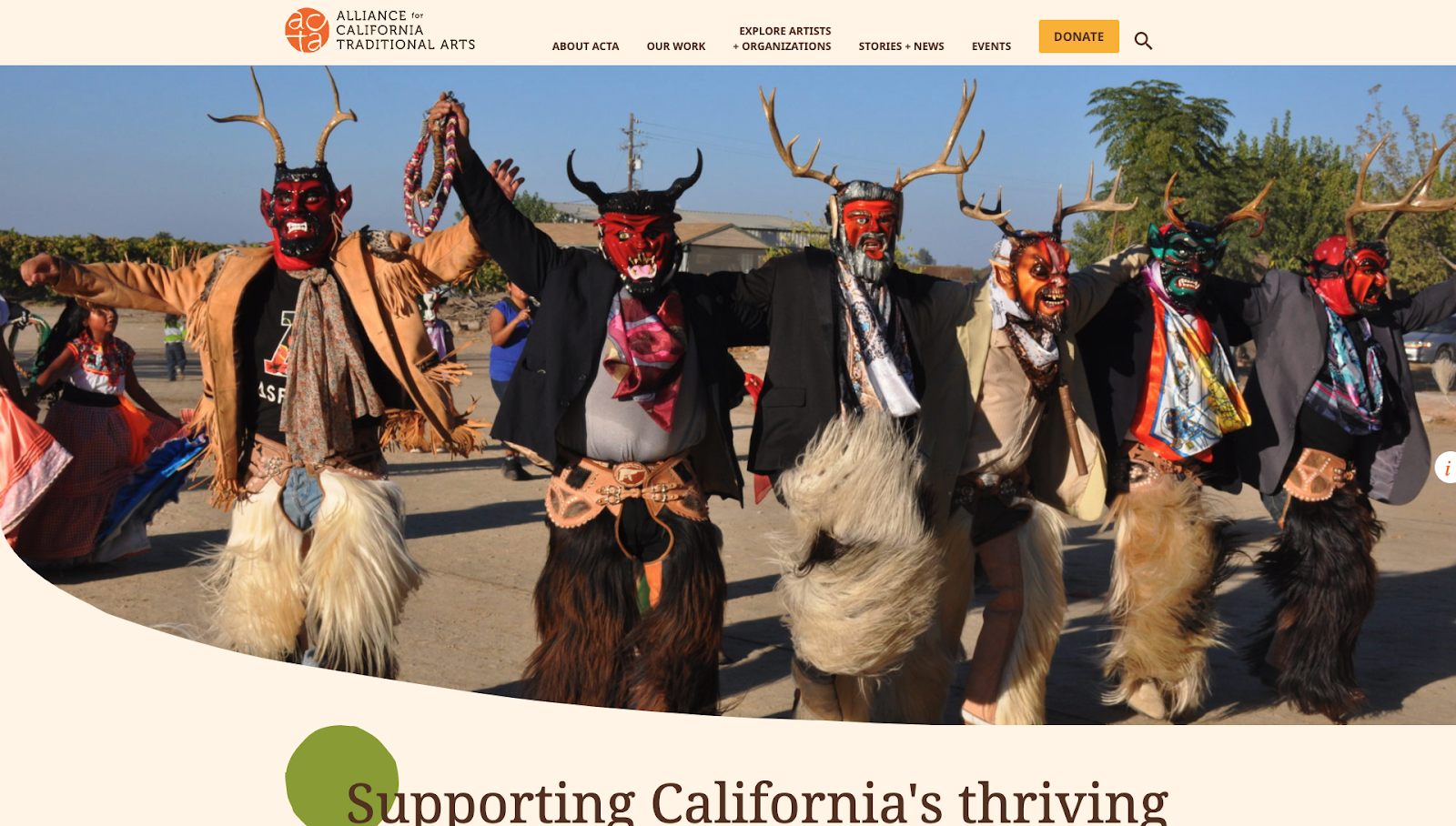
The Alliance for California Traditional Arts (ACTA) is a leading advocate of traditional arts and promotes the support of cultural practitioners and their communities. ACTA is a bridge between cultural communities, providing opportunities for collaboration and connection to various resources across California. ACTA’s website maintains their role – the site serves as a gateway to connect traditional artists and organizations with the general public.
Building awareness across a state
Forum One and ACTA worked together to enhance ACTA’s online experience. The website aims to build awareness on the state’s traditional arts. The site provides users with the opportunity to learn about the artistry, skills, traditions, and communities of different traditional artists and organizations. We redesigned the existing D6 website into a new streamlined WordPress site that highlights their programs and honors the artists and community members they work with. Our team installed and enabled custom SEO features on each post and page, which allows content administrators to increase their SEO scores.
We enhanced the About ACTA section to provide a clear understanding of who they are and what they do. The section highlights their mission, history, impact, and gives more prominence to artists and blog posts. In efforts to further connect and educate users, we elevated the Artists section to the main navigation and provided search capabilities to all profiles. Within the Artist profile pages, audiences are encouraged to visit artist websites and social media channels. The Resources section is updated to create engagement and is expanded to include more audiences than just artists. The digital improvements serve to create a better experience for online visitors by educating and connecting visitors with the traditional arts community.

Community and history through a digital experience: the Frist Art Museum
The Frist Art Museum, formerly known as the Frist Center for the Visual Arts, is an art exhibition hall in Nashville, TN, housed in the city’s historic U.S. Post Office building, which is listed on the National Register of Historic Places. The art center opened in April 2001 with approximately 24,000 square feet of gallery space presenting visual art from local, state, and regional artists, touring exhibitions from some of the most prestigious collections in the world, and award-winning shows organized in-house.
Sharing community and culture online
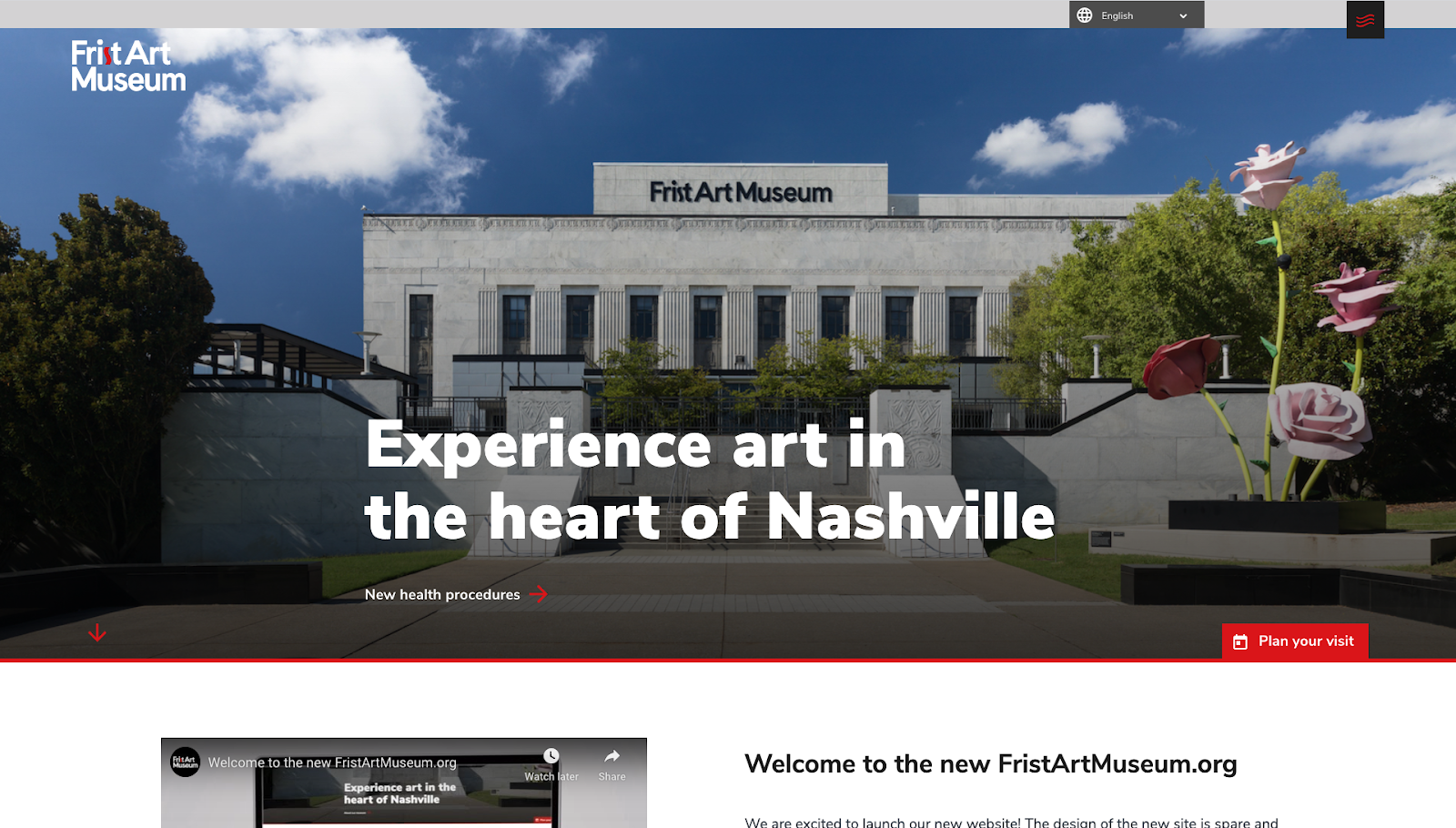
The Frist Art Museum wanted to communicate their commitment and contributions to the community while preserving the history of their building and the amazing work it houses. We worked with the Museum to tell the story of the organization by understanding the legacy of the building, learning about their work and exhibits, and determining the importance of their place in the community of Nashville.
The new website is clean and modern making it easy for users to find information about exhibitions, related resources, events, member benefits, family activities, and educator resources. The design makes the content front and center utilizing white space to draw attention to visuals and text so as not to distract visitors from finding information about their work. Subtle design elements such as squiggly highlight lines under headings, the squiggly shape of the site menu icon, and textures behind homepage and featured content provide a nod to the history of the building, connecting it to the vitality of the community in supporting this cultural institution.