Blog Insights
Reimagining Public School Websites
Background
FCPS is the 10th largest school system in the country. With a bus fleet of more than 1,600, FCPS has more buses than all of Greyhound. The school system has 24,000 full-time employees. All of this adds up to a huge organization.
Forum One was tasked with designing a new website system for FCPS that could accommodate the needs of approximately 200 elementary, middle and high schools, as well as other learning centers and FCPS administration. The sites needed to be easy for FCPS personnel to update and have the ability to delegate responsibility for various sections of each site.
The Vision
- Mobile first. A Forum One analysis of FCPS site traffic found that over 50% was coming from mobile devices, so we knew the sites needed to be extremely mobile friendly.
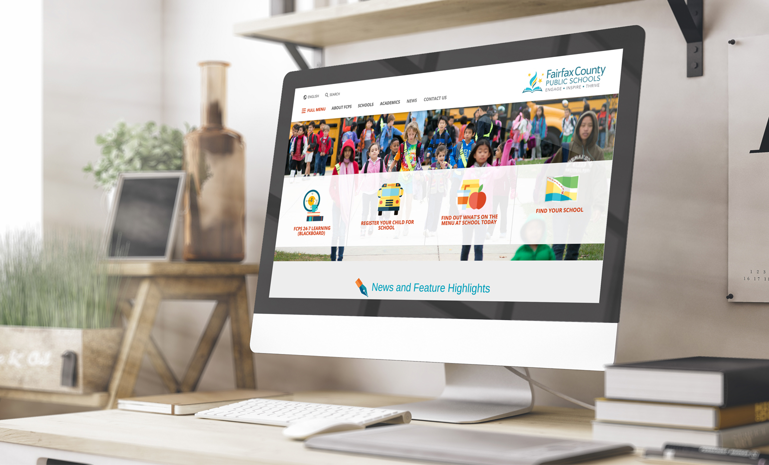
- United yet unique. Each school needed to have its own unique website with a customized color palette, yet remain on-brand and easily identifiable as belonging to the FCPS family of websites.
- Gold standard for school websites. As one of the largest school counties in the country, the new FCPS websites could set the standard for other school systems across the country to point to and say, “yes, please!”
Setting the Visual Direction

When we started working together, FCPS was already well into rebranding their visual identity with new colors, a new logo, and more. We therefore used this as the starting point for creating the website visuals.
We showed concept directions to stakeholders to arrive at a consensus around the design direction. We created realistic mockups of what a FCPS landing page might look like under each design direction, including aspects such as navigation placeholders, logos, content, and more. You can think of it as the start of the final design, or a high-fidelity sketch.
We shared three concept directions with the FCPS team for how we could design the sites, and their subsequent feedback helped shape the initial designs.
Designing the User Experience
While the design discovery phase was ongoing, Forum One’s User Experience (UX) team began to establish the new information architecture for the FCPS ecosystem. Through wireframes, sitemaps and much more, we started fleshing out how to organize the sites at the macro and micro levels, establishing UX patterns and more.
FCPS was closely involved in discussions about information architecture to ensure that we didn’t make any invalid assumptions around how pages come together, and what users expect to see when they arrive at certain pages.
We used tools like UXPin to create basic wireframes we then used as reference points in the final visual design.
A Mobile-First Approach to Navigation
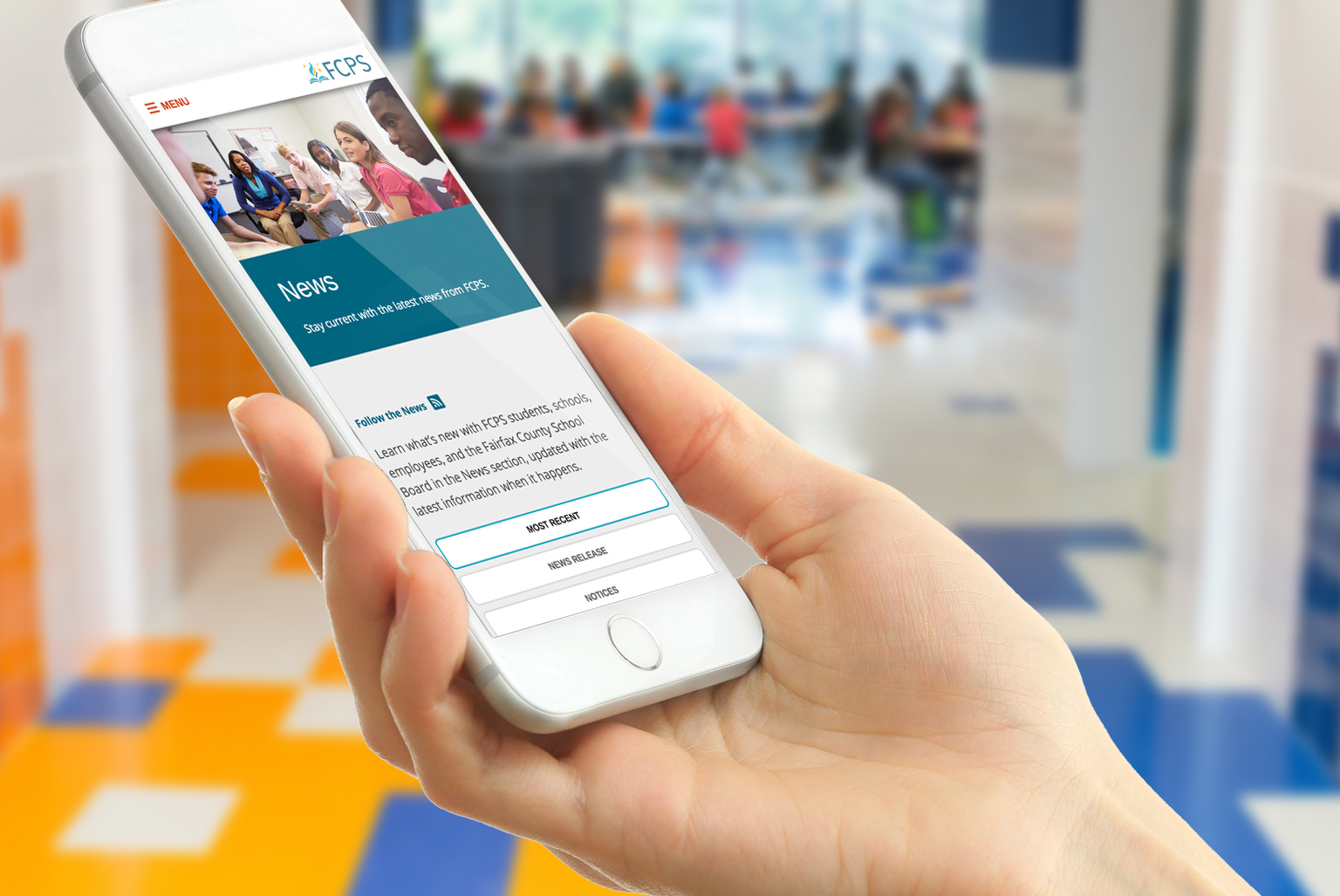
The smaller screen real estate of mobile devices limits the use of traditional navigation menus, such as header menus or left column menus. Rather than radically reorganize how the menu works across different screen widths, we decided to make the experience pretty much the same across all devices.
The “hamburger” menu is designed to allow access to all site content, with some key links repeated within the horizontal header section at the top of the site. As the screen width reduces, the exposed links disappear, but the hamburger menu remains.
In addition, since many pages existed several layers deep in the FCPS sitemap, we needed a menu system that could infinitely allow users to navigate deeper without getting confusing or awkward. The standard vertical “drawer” style navigation menus used in many mobile sites can get unwieldy as a user opens more and more drawers to reach deeper and deeper levels in the site architecture.
We looked toward the settings menu of mobile phones in the iOS and Android families for inspiration. Each time a user digs deeper into a menu item, the entire menu changes to accommodate the current layer of content, while at the same time giving the user an easy exit back to where they started.
Painting with Modular Design

“We’re not designing pages, we’re designing systems of components” – Stephen Hay
Part of designing something as large and complex as the FCPS website ecosystem involves embracing the concept of modular design. Essentially, we focus on designing components – think of them as little lego blocks – rather than entire pages. The components should look attractive when all combined, they should function intuitively, and of course they should be responsive so that they work and look great on mobile devices.
Our IA and UX work allowed us to identify what components we would need to design the FCPS websites. Using the concept directions from the earlier phases of the project, we started designing the components we would use to build the final site.
We used Pattern Lab as our primary tool for ensuring the components all played nicely together. Pattern lab is also extremely useful for seamlessly integrating the front-end development with the back-end Drupal development, so it’s a bit of a Swiss army knife tool for us.
Designing In-Browser
“Photoshop comps are the most effective way to show your clients what their website will never look like.” – Brad Frost
Traditionally, web designers tend to use static design tools such as Adobe Illustrator, Photoshop, Fireworks, or Bohemian Coding’s Sketch.
However, the FCPS design had a lot of interesting interactive elements we felt would be difficult to capture in static comps. Tools like Photoshop can’t show you how it will feel to click on a menu, how fast or slow the menu will animate, or how the experience will perform on mobile. So we decided to rely a lot less on Photoshop, and more on designing in-browser.
The best tool we found to this end was Webflow. Webflow is a relatively new in-browser design tool that allows you to create functional websites without having to code. It lets the designer focus on the design and interactivity, without having to wrestle with code.
We used Webflow to create functional prototypes of the major page types. So while we began the design discovery process with traditional tools like Photoshop to create the concept directions, the first glimpse FCPS got of the proposed final design was in a fully functional prototype that they could load and explore on their own phones and laptops.
This proved to be invaluable in gathering early feedback from FCPS, since they could quickly test the design across various phones, devices, and browsers. We were able to reuse the components we created in Webflow for other page designs, which provided further layers of quality assurance. We could also turn our design focus to impactful details and interactions, like animations on interactive components such as buttons, in ways static comps just can’t capture.
We were also able to ensure that many small nuances in the design did not get lost in translation when moving from the designer to the developer, the way they can with static comps.
Here is an example of one FCPS landing page we designed inside webflow, and another example here of a detail page.
A Flexible, Accessible Color Palette

Inspired by Google Material Design color theory, we created a flexible array of school colors that FCPS schools could use to design their individual sites. We pre-selected a range of colors that would not only meet schools’ needs and look nice when combined, but would have sufficient color contrast to remain legible and accessible.
Since Section 508 has no color contrast requirements or guidelines, we adhered to the World Wide Web Consortium’s (W3C) web content accessibility guidelines (WCAG) for color contrast. This way, no matter what color combination an FCPS school selects, the contrast stays accessible.
Lessons Learned
Designing in-browser turned out to be a valuable experience for the entire team – from FCPS stakeholders, to Forum One’s front- and back-end developers, to designers, and the project manager.
The UX process we followed to arrive at concrete decisions regarding site architecture also included close conversations with the design direction, to ensure no decision was overly optimized for UX at the expense of visual design or vice-versa. This way, we arrived at the best solution to address both needs.
Focusing on mobile-first and ensuring that every design decision we made would translate into an intuitive mobile experience in turn made the desktop experience much simpler and more elegant. The pages are not cluttered with content, and they don’t look old fashioned. Everything is designed in a vertical, linear manner, the same way a user would absorb content while scrolling through the site on their phone.
At the end of the day, all of the moving parts of Forum One’s web design, user experience, and development processes came together smoothly to create a website system for FCPS that everyone can be proud of.