Blog Insights
Improving Financial Education Through a Strong Digital Experience
When we first started talking to the Bureau of Consumer Finance Protection (BCFP), the idea was simple: take a paper copy of a curriculum review tool and turn it into an online, interactive version. However, we all quickly realized that to do it right, we needed to dive deep into best practices.
The tool in question is BCFP’s Youth Financial Education Curriculum Review tool. It allows educators to evaluate financial education curricula and determine if they are strong resources. As mentioned, the tool already existed in paper form, so for the most part, the content was already set. However, in bringing any piece of content in the online world, people’s expectations and perceptions naturally shift. The Internet is dynamic and interactive, and so online users expect a certain level of robustness and ease when using a digital tool.
Coupled with the endless technical possibilities of the digital world, we understood its strength in making the tool easier to use. If the tool is easy to use, then it’s that much easier for educators to incorporate into their classrooms.
Understanding the Audiences
For this project, we approached it as we approach all Forum One projects: by taking the time to understand for whom we’re designing. During the discovery phase, we did a lot of research and asked a lot of question to both BCFP stakeholders and educators.
Key questions we posed to the BCFP team included:
- Who are your target audiences? Who are the primary audiences? Who are the secondary audiences?
- How do they currently evaluate and select curricula?
- What are each of their goals in using this tool?
- In what context are they using this tool?
- What will they do once they’re finished using the tool?
Why do we ask so many questions about the target audiences? Excellent question! Because when you design for everyone, you design for no one. This means that if you say that the tool is for absolutely everyone, you then design for everyone in the world. This sounds great, however, designing for everyone means incorporating so many features that it is no longer a streamlined or effective experience for those who will use it most.
In gathering the answers to the above questions, we were able to focus on designing an appropriate and usable experience for the key people who would need to utilize it. For example, a key audience group identified was educators who are looking to start teaching financial education, but don’t have the resources or training to know where to start. In addition to being easy to use and approachable, we therefore knew the tool also had to be comprehensive and easily incorporated into their everyday work.
Identifying the User Journeys
Now that we had a firm understanding of who we were designing for, we started to define the exact journeys they would take in using the tool. It can be more effective to design a complete user journey map for a product; however, as the tool was a relatively-contained product with a defined (and nearly linear) series of steps, we simply wrote out the user journeys. Each journey outlines everything from when the user first starts to learn about the tool, to then working through, and finally receiving the results of the review.
The two main reasons to define the user journeys for this tool were to:
- Understand how the audiences would most likely walk through the tool, to ensure that it met their expectations and goals.
- Begin to explore how the interface and pages could look like.
Designing the Solution
We relied on the journeys to help craft and direct the design solution. Since we identified the scenarios and steps that a educator was most likely to take to use the tool, we then started to match the tool to their expectations.
As an example, we took the scenario of a educator deciding to evaluate a curriculum over his/her lunch break, which could be only 30 minutes long. With this in mind, and the fact that the review would likely take longer than 30 minutes to complete, we knew that we needed a way for them to pause and pick back up at a later time. This led to three crucial design decisions: (1) Include information on the estimated time it takes to complete each section; (2) Provide clear information on how to save answers; (3) Use cookies to save work, so that they could come back and complete the review on the same device.
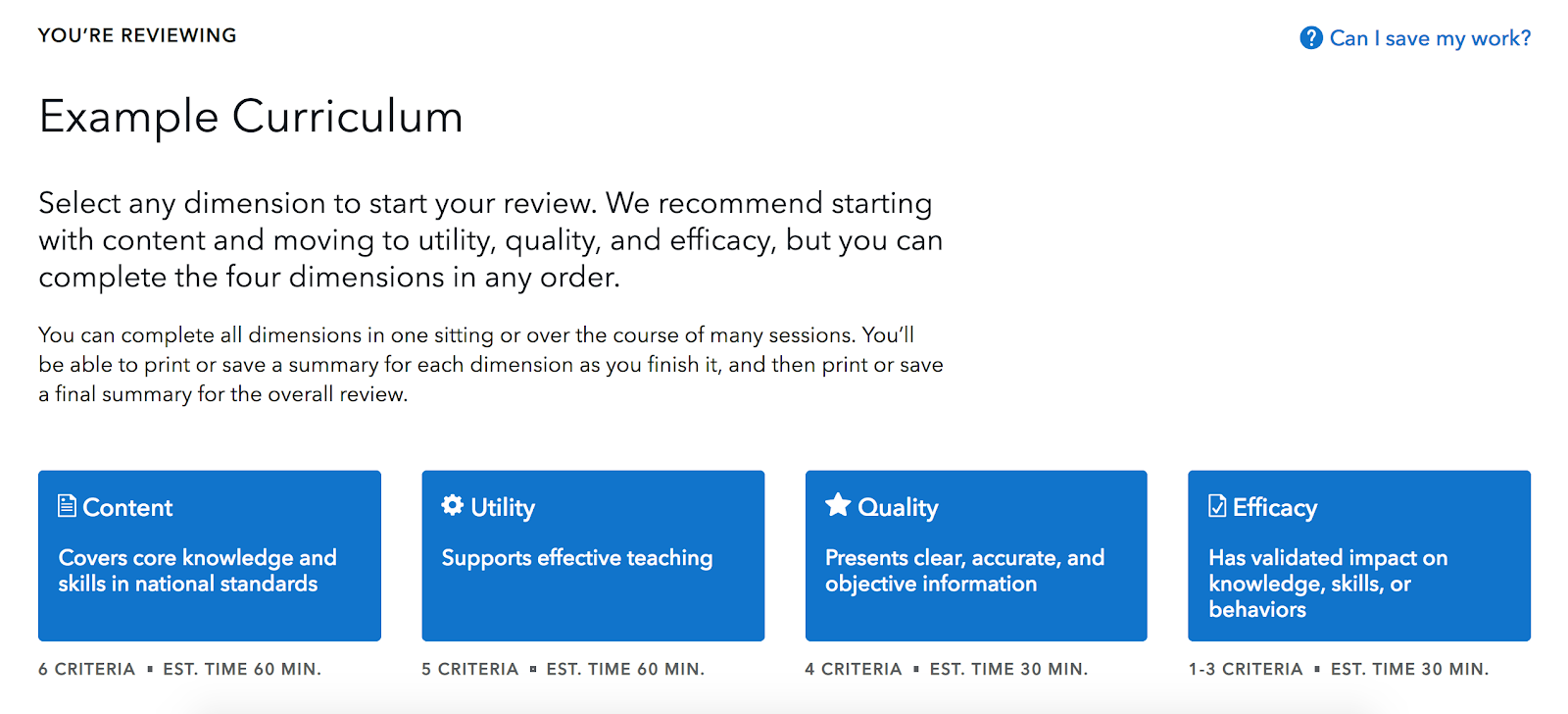
Accommodating for educators’ busy schedules: displaying the estimated time for completion and providing information on how to save their work.
Another scenario of how the user journeys informed our design solutions is when a supervisor requests that a educator evaluate a curricula and then report his/her findings back. To accommodate for this, we designed the tool to include options to either generate a high-level findings report or a more comprehensive report. Similarly, we made sure that there was a printable version of the reports, so that they could print it out and bring it to their next meeting. Providing these options to educators was essential to accommodate for their journeys through the tool.
Evaluating the Solution
As the tool started to take shape through wireframes and designs, as well as server builds, our team conducted extensive quality assurance (QA). As part of the QA process, we walked through the entire tool to (1) identify any bugs in the development; and (2) ensure that we had designed a solution that truly met the needs of the audiences and journeys we had identified.
During this process we also established potential edge cases, e.g., a primary audience member using the tool on a borrowed device and evaluated whether the tool could (or should) accommodate for them. Again: when you design for everyone, you design for no one. If we accommodate for all edge cases, the tool starts working away from those who need and use it most.
Basking in the Results
Transforming the Youth Financial Education Curriculum Review tool from its paper version to an online interactive tool has made it more approachable, streamlined, automated, and easy to use. In designing the tool according to the user journeys, the tool is guaranteed to fit neatly into the educators’ classroom preparations.
Though some states have financial education requirements, it is currently not a national mandate. If we want educators to be able to incorporate financial literacy into their classroom curricula, then we need to make it easy for them to do so. We are proud to have played a role in ensure that this tool’s goal, to help make selecting a curricula easy and clear, is achieved.