Blog Insights
How Long Should Your Web Page Be?
There are three words none more contentious in web design than: users don’t scroll. People often cite the Nielsen Norman Group (NN/g) as the source of this conclusion, but as NN/g’s earliest studies on the subject date back to 1994 (not to mention that their first study included only three participants!), the Web is clearly a much different place in 2019.
As we officially delve into a new year, and take stock of the latest and greatest web design trends of 2018 and predictions for 2019, do we have a good sense of whether users prefer to scroll or not? While NN/g’s 1994 web usability report suggested that people simply don’t scroll, web design has made leaps and bounds, especially as mobile screens play an increasingly central role in users’ online experiences.
 Images from NN/g’s 1994 web usability report.
In 2014, Huge Inc conducted a study that showed that regardless of how a homepage was designed — whether with an arrow pointing down, animations that bounce, text that explicitly says scroll, a very short image with content below peaking, or an image that extends past the fold — all participants scrolled. While we are now five years on, this study’s conclusions remain in line with what we are seeing in our own user testing.
Images from NN/g’s 1994 web usability report.
In 2014, Huge Inc conducted a study that showed that regardless of how a homepage was designed — whether with an arrow pointing down, animations that bounce, text that explicitly says scroll, a very short image with content below peaking, or an image that extends past the fold — all participants scrolled. While we are now five years on, this study’s conclusions remain in line with what we are seeing in our own user testing.
Short or long? It depends.
So how does this apply to the length of your web pages? The truth is: it depends. It depends on your goals, and it depends on how your users are engaging with your content already. In terms of your goals — whether that’s to provide a broad overview of your mission, showcase your work, or get users to engage with a piece of content and take a desired action — you can track success through conversion rates, sharing metrics, time on page, bounce rate, user retention, and SEO ranking. Launching a website is the end of the beginning and paying attention to Google Analytics and heat mapping will tell you more about how successful a portion of your webpage is than aggregate studies online. If users are consistently not engaging with a section of your homepage, consider reworking that area, e.g., rewriting its copy, using a button instead of a link, changing the color, switching out photos, adjusting its position to be higher on the page, or perhaps removing it altogether if it turns out to not be valuable. According to a 2018 study by NN/g on scrolling and attention, users spend 74% of their time on the first two screenfulls; however, just because they don’t make it to the bottom doesn’t mean that the content below isn’t valuable. Users may stop scrolling because they have already found what they are looking for or they realize that the page isn’t the content they seek.The short page game
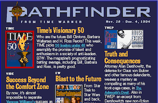
If you’re generally leaning towards a “less is best” approach to page length, then it’s important to think about why you’re making a page short. Studies show that long-form content, on average, earns more engagement, higher rankings, and more shares than short-form content. However, if you have a single CTA you are aiming for, simpler may be better. Competing calls to action may result in users overlooking the one you really want them to take. I would also be cautious against crowding a layout with content in an attempt to keep the page short. If 100% of your users make it to the footer, it does not mean that you have designed a successful website, nor does it assume that they had a great experience. Just as contentious in web design as, “users don’t scroll” is, “where does this appear in the fold?” There is a tendency to crowd the mainstage of a website with all of the content important to a company. The problem with this approach is that if everything is important, then nothing is important. CTAs are one of those things in marketing where more is not always better. By cramming too much into a small space you are making it harder to digest your content. The same battle has been playing out in the world of print for years. Take a look at two magazines that you might see beside each other in a grocery store checkout line.
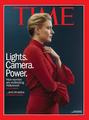 You are likely familiar with these two design approaches. Can you crowd your layout with text, type, photo and still have your magazine or website work? Sure, this approach has been successful in many cases. There are extremes on both sides, but it depends on what approach makes the most sense for your content and brand position. Users will make judgements on the type of company you are as soon as they land on your web page.
The long page game
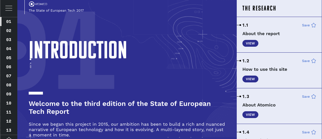
Some common concerns around long pages are that users can’t tell how much content is on the page or where the bottom of the page really is. A “false bottom” is when a photo or color band takes up 100% of the screen which makes the user think they have reached the bottom of the page and that there is no more content. One solution that addresses both of these concerns is vertical pagination that acts as an index or progress indicator. This idea has been around for a while but is becoming more sophisticated and making a comeback. Let’s look at a few examples. In the below example, County Health Rankings and Roadmaps uses traditional vertical circle pagination on the left with the addition of the section title.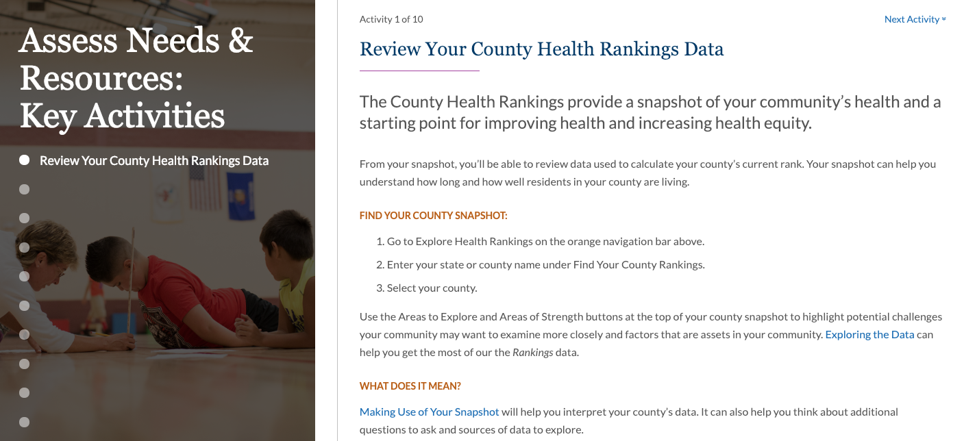 As another example, Atomica lays out its State of European Tech report the circles are replaced with numbers. Both examples give you an idea of how much is on the page, where you are on the page, and also makes it easier to return to a previous section.
 NN/g recommends providing anchor links at the beginning of an article as an index for especially longform content as another way to make content more accessible and give an idea of how much content is on a page. For interior pages, content can be accompanied by a time estimate, e.g., to indicate whether it is a 5-minute or 15-minute read, to give a better sense of what to expect.
In terms of analytics tracking, note that percentage of completion shouldn’t be a single metric of whether or not you should shorten your content. The New Yorker has notoriously long content and often this prevents users (including me!) from finishing articles. Instead of compromising on quality, they add an audio option to the web page version that serves as another point of entry into their product and to increase retention. For example:
NN/g recommends providing anchor links at the beginning of an article as an index for especially longform content as another way to make content more accessible and give an idea of how much content is on a page. For interior pages, content can be accompanied by a time estimate, e.g., to indicate whether it is a 5-minute or 15-minute read, to give a better sense of what to expect.
In terms of analytics tracking, note that percentage of completion shouldn’t be a single metric of whether or not you should shorten your content. The New Yorker has notoriously long content and often this prevents users (including me!) from finishing articles. Instead of compromising on quality, they add an audio option to the web page version that serves as another point of entry into their product and to increase retention. For example:
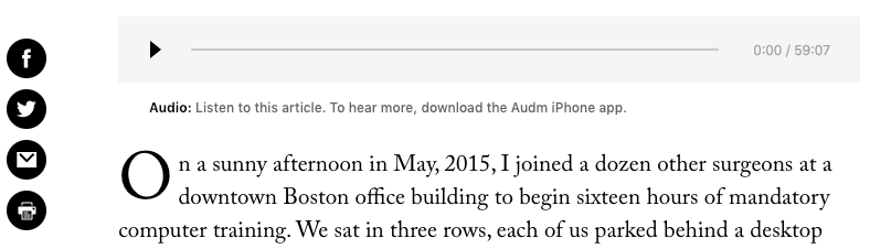 New Yorker article with audio option on why doctors hate their computers.
Longform content rich websites, such as the New York Times, Medium, Washington Post, New Yorker, generally go against the advice of false bottoms and feature full-page photography to create memorable user experiences with additional full-width photos that contribute to the story. Here’s a nice example.
New Yorker article with audio option on why doctors hate their computers.
Longform content rich websites, such as the New York Times, Medium, Washington Post, New Yorker, generally go against the advice of false bottoms and feature full-page photography to create memorable user experiences with additional full-width photos that contribute to the story. Here’s a nice example.