Blog Insights
Good Data Visualization Practices: Dot Plots and Kin
The Pure Dot Plot – A Simple Histogram
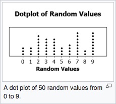 Let’s start by taking a look at the basic dot plot, defined as nicely as anywhere by Wikipedia. For a given set of values, you mark a dot for each instance in the data, stacking them vertically (or horizontally if using that orientation). The result is a simple histogram. The dots represent the number of instances of a given value within the data. The example from Wikipedia, for instance, shows the number of times numbers between 0 and 9 came up during 50 random selections.
As you can see, if you have a modest-sized data set with some interesting characteristics to it across categories, the dot plot produces an easy to scan, read, and explore visual. The dots leave no doubt about the values, so the stories emerge quickly and clearly. My son’s teacher was onto something!
Applying a Basic Dot Plot
Some months ago, my reintroduction to dot plots took off. In looking at a client’s draft outline, I came to a section describing the range of percentages across states of individuals responding in a certain way to a particular question. The thought was to show a long bar chart of all the states’ percentages, in order. While that would certainly have worked fine, I kept looking at the word “range.” It would be nice, I thought, to better see the distribution of values in one view. That suggested a histogram. There were just fifty-two values, though, and the range was not too wide – could they all fit with bins of one? Before long, I had sketched a pretty straight-up dot plot, which became the mock-up below (the data is not real and not all states are on it, but you can see the idea).
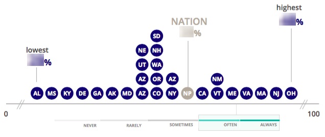
The visual makes the range much more apparent and shows where clusters are. It is easy to pick out states at different points, their relative values, and what others are nearby. If there were outliers, they would show nicely, and the extent to which they are outliers would be immediately obvious. While all these points can come across in a long bar chart, they would not do so as easily.
Dots in Place of Other Bar / Column Charts
Sometimes it is nice to be able to visualize a number by more than just giving it a nice text treatment. For another client, I recently created a page type that would highlight one of the organization’s areas of focus. I thought it would be useful to show the number of projects the organization had in each area. I could have just listed the number, but I wanted a visual to help give a sense of the depth of each focus area, should users view multiple such pages. The next option would be a single column chart, set on the same axis for all focus areas. That would accomplish the goal, but also be abstract.
 I turned again to dots. Since I suspected the numbers would be modest, at least in the near term, I used dots to create a column chart of sorts. The stack would be a uniform width and total to the number shown. The extent is shown by the count, not by the height, though height differences provide an order of magnitude sense. The advantage is that the dots are easy to count, even roughly and at a glance. Our brains are pretty at good at that. Bars are harder to judge precisely; we are just less good at estimating distances.
An obvious problem with these dot-based charts should be becoming clear: with larger numbers, they degrade. If the numbers I wanted to show were in the 100s, for example, there would simply be too many dots to count and show easily (unless the numbers were very round and a dot could say, equal 10 rather than 1). Ditto the dot plot using cities rather than states. At this point you would have to drop back to a basic column chart or traditional histogram, respectively. As always, you need to know your data and tailor the charts accordingly. The dots will work in many cases, but, to be sure not all.
Dots for Square Pie Charts
 I have also started using dot-based charts in place of the maligned pie chart. I got started on this path thanks to a piece I read by Robert Kosara showing the relatively better performance by square pie charts versus both pie charts and stacked bar charts. A square pie chart is where a square is shaded, generally using an internal grid (though the one Kosara used, at the right, did not have a grid), in proportion to the value one is trying to show. Generally the grid is 10×10, so there are 100 squares within the square. The chart is sometimes also known as a waffle chart because of this grid. It seems people are better able to estimate values of a proportionately shaded square than they are estimating an arc (pie chart) or a length (bar chart). They are also more confident in their estimation, according to the study behind the paper.
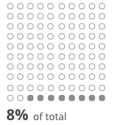 My only issue was that square pie charts look – to use a technical term – ugly to me. The squares and grids just seem too massive and overbearing. What if, I wondered, you made the same 10×10 structure, though, using dots? An example is at the right. I don’t have an research to back up my hypotheses at this point, but I suspect that the same effect that makes square pie charts successful in show proportions would work here, and perhaps better since it may be easier still to eyeball a count. It certainly looks more elegant, to my eye.
Replacing Stacked Bars with Dots
Kosara’s piece added to growing evidence I was seeing that stacked bar charts don’t actually work well. While they still have their place, particularly if one follows certain guidelines (a topic for another post), I had a couple recent cases that gave me reason to consider some alternatives.
The nice thing about stacked bars, for me, is that they convey the part-whole relationship. You can simply unstack the bars and remove some of the issues bar charts bring, but you lose that sense that all the bars together make up a total amount. Is there a way to give the clearer view of relative differences between the categories that unstacked bars provide, while still providing a sense of the whole? One possible solution was to bring dots in to create a hybrid.
The chart below is a wireframe mock-up I did of one possible solution. It uses dots to create bars, each with a different color. Because the bars are percentages, though, there are 100 dots as in the square pie above. The collection of dots provides some sense of the whole in a way bars would not.
To be clear, I have not tested this chart, but it is intriguing and demonstrates how collections of dots can be more malleable than bars.
In this same vein, my team recently created the chart below, which comes from a working prototype (the data values are random but realistic).
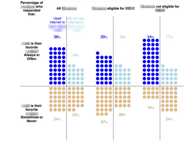
The problem here was how to show a three-way cross-tabulation, showing the relationship between response to two different survey questions, overall for a type of person and for two subgroups. We played with many variants involving stacked bars and multiple steps, but none quite captured the four different possible cases for each group, yet highlighted the always or often side, which was most interesting. One of our clients mentioned a matrix and that jogged my brain into thinking about dots.
This chart again uses 100 dots for each respondent group, and the dots in each quadrant function like bars in the sense that the as stacks of equal widths they convey magnitude. It is the count, though, that matters, so there is no positive or negative side to the axis. The stacks extend in different directions, but it is only the number that matters, again easily perceived by our brains. With a little more treatment in front-end development, the difference between the group overall and the two subgroups will be further apparent, and the entire story, that of notable differences by subgroup, will come through.
Limitations
As noted above, the dot paradigm I discuss here only works with modest numbers or highly round numbers where a dot can represent, say, 10 or 100. With data of 297 and 342, for example, dots would be a poor choice. Nearly all examples here are percentages, though, and 100 is a fine number to show this way, and a common one at that.
You also need to be sure that you are working in whole numbers, or that you can live with showing a rounded number of dots. Fractional dots wouldn’t work well.
No chart is good for every case or even a majority, and dots are likewise no silver bullet. I hope the examples here show that, for the right cases, using dots to represent values is an effective and engaging way to visualize data.