Blog Insights
Good Data Visualization Practice: Tile Grid Maps
As a reminder, this series grew out of our work with the National Assessment of Educational Progress (NAEP), the U.S. Dept. of Education program that provides the most comprehensive picture of students’ academic progress and performance (Forum One works with NAEP as a subcontractor to the Educational Testing Services (ETS).
What is a Tile Grid Map?
A bit over a year ago, I ran across an article titled, London Squared Map – Making the City Easier to Read. It discussed a new way to display data about London. It noted that the shapes of the city’s boroughs, about which one might want to show comparative data, didn’t actually lend themselves to this application. Many are small and all are irregular, leaving little space to do more than a typical choropleth map.
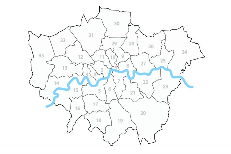
Even the choropleth was problematic, the authors noted. Because of the differences in size and odd distribution, shading could tell a muddled story. A dark color in a small borough could get lost amid lighter colors for a bigger borough. In aggregate, the view could distort the viewers’ perceptions of the number of boroughs in different categories.
Their solution was to abstract the city into a set of equal squares, save a few in the center that encapsulate the iconic path of the Thames River for reference. In this version, every borough was equal, and one could better mentally count numbers in categories if shading represented data. Even more, the squares allowed for inclusion of different sorts of data displays, making the map a nice small multiple visualization. It isn’t clear what the data represents, but you get the idea.
The visualization above is a rich tile grid map. It is a set of equal shapes arranged to mimic an actual map and better display data that might otherwise get distorted or limited by a classic choropleth view.
Can This Idea Be More Broadly Applicable?
My first thought was, obviously, “cool – but could this work for the U.S.?” I put pencil to paper. The short answer is, it works, but not without some trade-offs.
To illustrate the idea using a map more familiar to many in the audience, consider a simple dataset: the time I have spent in each U.S. state. Here it is as a basic choropleth:
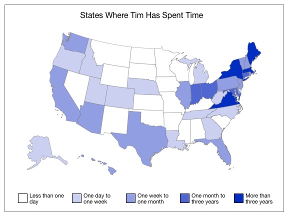
The map is familiar and we can pick out the data, but it does illustrate the same issue as the London one: the irregular sizes of states distort the view. It so happens I am a Northeasterner, and I have spent much of my time in small states. All in all, I have spent considerable time in a large number of states, but, because they are mostly small and packed into the northeast, the number seems smaller than it it is.
Here is the same data on a tile grid map of my own construction:
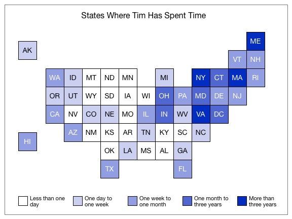
You can see that the rough shape of the U.S. is still there, including the classic markers of New England, Florida, Texas, and even Michigan. Even Alaska and Hawaii get handled a bit more elegantly. What’s more, from a data visualization perspective, now each state is the same size and the distribution is a bit fairer. Yes, I am deficient in the Plains, Upper Midwest, and Deep South, but the numbers aren’t quite so bad as those big, white states on the choropleth suggest.
Now, even a modest study of the tile grid version will show its issue: uhhh… states are in funny places. The same irregularity in size and shape that this map fixes also bites it. Trying to fit the same number of states into the same rough outline using regular shapes means they don’t fit together right anymore. The problem is particularly pronounced in the northeast, where PA is due west of MD rather than due north and MD and NY above, and so on. TN and KY become side-by-side, rather than stacked, while OH and IN become stacked, rather than side-by-side. It isn’t, in short, a fully-accurate map. I suspect – though I have not tested this – that people can still find their state, because it’s still in roughly the right place, and that is most important. They can also probably learn to navigate the odd arrangements because they aren’t so far off in most cases. This is a new concept, though.
How and When to Use Tile Grid Maps – Some Resources
As it happens, others were tackling the same problem of making tile grid maps of the U.S. at the same time. There are, thus, ample good examples. You will find maps using squares with slightly different configurations. They have the same fundamental problems, though I personally feel they are not as good at capturing the essence of the overall U.S. Others have chosen to use hexagons instead of squares, judging they better capture the shape and better handle relationships. Again, I disagree that they do as well, but they certainly have found a following in notable dataviz corners (e.g., NPR).
-
The piece I referenced at the outset, London Squared Map – Making the City Easier to Read, is a great introduction and worth reading in entirety (it isn’t long).
-
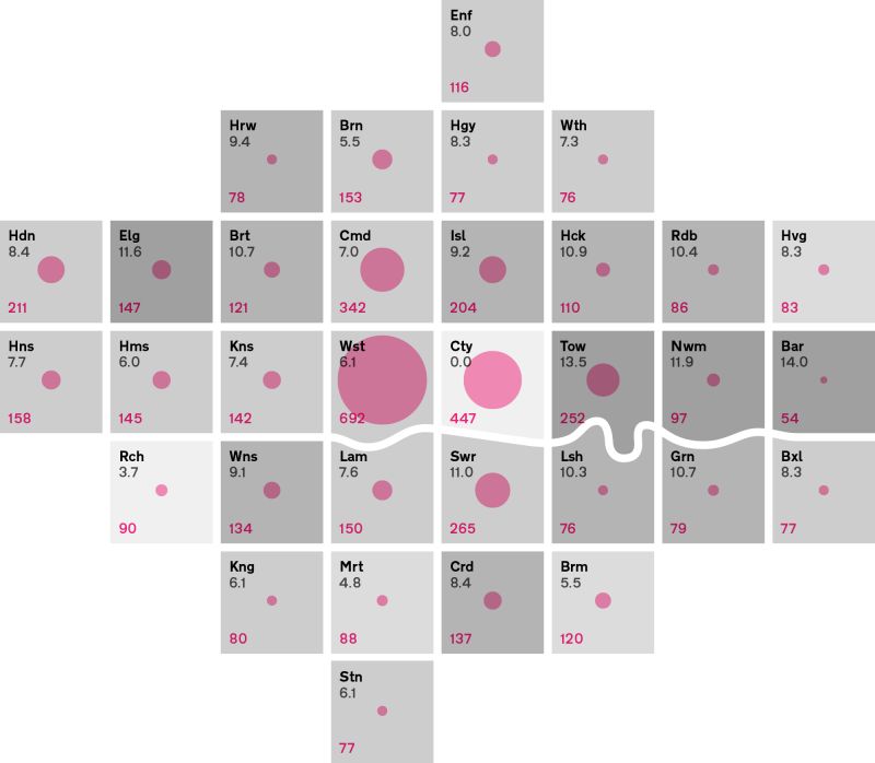
Data Visualization Strategies Using Tile Grid Maps on GISLounge is another good explainer, with a different square-based map and a nod at one using circles.
-
Let’s Tesselate: Hexagons For Tile Grid Maps is NPR’s explanation of tile grid maps and explains its choice of hexagons. It also throws cartograms in as another comparison.
-
How to Make Tile Grid Maps in Tableau is what it suggests, and includes a couple of useful examples of U.S. maps using squares.
-
Gun ownership in the U.S.: A primer is a Washington Post piece with a different U.S. map using squares. An unprecedented experiment in mass forgiveness is a different Post one with different solution using squares. They have also started opening up the squares, cutting them diagonally to show support for Trump by Senator. You can see the experimentation going on here.
-
Washington Post recently used circles for the tiles, using both size and color of fill.
And, of course, there is this more, ah, extreme case:
I humbly submit this to the tile grid map debate. cc/ @dannydb pic.twitter.com/viMOinP8Yy
— Katie Park (@katiepark) May 12, 2015
So What Are the Pitfalls of Tile Grid Maps?
The biggest issue with any variant of the tile grid maps above is that they are not accurate maps. If you can’t handle seeing DC adjacent to both NC and DE, or any other of a number of odd re-neighborings, they aren’t for you. I would argue in many cases this is not the right tradeoff to make, but it is not an unreasonable one.
In some cases, it won’t be a matter of preference. Sometimes the size and shape of states matters for the data. Consider a map showing where a disease had been reported. If it is all in the northeast, that gives a sense of where it is and where resources are needed. The fact that it is in ten states is less important than that it is still a ways away from most of the U.S. In short, if counting isn’t the point, and geography matters, a choropleth may be better.