Blog • Insights
Building a Data-Intensive Mobile Application
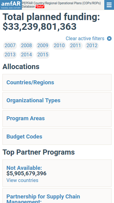
The amfAR COPs/ROPs Database is a database application containing a great deal of information about the way PEPFAR allocates funding to its partners through a variety of implementing agencies. It’s a major boon to transparency in AIDS funding, since users can break data down based on a number of dimensions: country, partner, program areas, and even cross-cutting attributions.
When we first released this application, our build focused exclusively on a desktop-style layout:

That being said, when we then did a deep dive into the site’s analytics, we found that a lot of users were trying to visit the application on their phones. At this point, it became pretty obvious that we really needed to create a mobile-friendly version.
Due to the challenges of showing complex data on smaller mobile screen, it goes without saying that we had to overcome a number of hurdles. Design-wise, the questions we faced boiled down to, “How do we shrink an interactive graphical database application to fit the constraints of a mobile browser?”
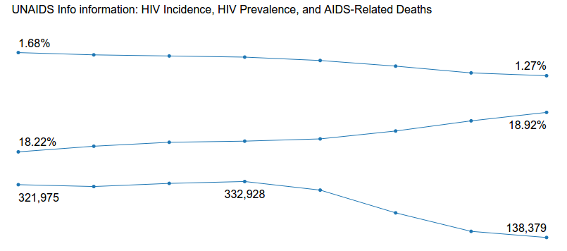
We threw around ideas for a handful of charts with a slightly more stripped-down presentation. Several ideas even made it to the prototyping stage, e.g., this chart that uses epidemiological data from UNAIDS:
The design was well-received, but we still had some lingering UX questions that we still needed to answer, such as, ”how would we handle the display of targets alongside results?” We decided, at least for the first iteration, to stick to tabular presentations.
Some technical issues guided our designs as well. The COPs/ROPs application is a beast, at least in the eyes of a smartphone. It’s graphically intensive and includes a number of fairly hefty dependencies; D3, C3, and jQuery are together almost 400KB, and that’s even before we have to add the weight of extra data loads for charts, the Google Geochart library, and fonts. Let’s also not forget that the browser must keep all of that in memory in addition to the page’s DOM. Grabbing a random heap snapshot from Chrome says I’m using about 50MB of memory. For a desktop, that’s not much, but when you consider things like the iOS memory budget, we’re bumping up against somewhere between 1/6th to 1/10th of the memory available to Safari, and that’s with ideal conditions. Having other applications open means Safari will have much less space to use.
The Implementation
After talking things through, we agreed that the best solution was to build a separate mobile site. In this way, smartphones don’t have to pay for the memory or bandwidth usage of the main site’s assets, and we can tailor the content for users.
The build used the same database and application layers as the main application, but resides in its own separate area with its own controllers and, more importantly, templates.
The layout was simple enough that we could use flexbox to style a small number of elements — notably, the header menu — and use simple CSS elsewhere. That having been said, mobile devices don’t make CSS easy; I was bitten by iOS Safari’s need to have the “-webkit-appearance” property set in order to respect custom button styling. The interactions were so simple — I estimate a maximum of five total — that we avoided the use of a JS framework altogether. Animations were handled in CSS and the JavaScript code only added or removed classes, thanks to the handy classList API.
The hardest part of any mobile build is device testing. Most browsers have “responsive” modes that match a specific device’s screen and orientation, and more advanced simulators can even emulate some device rendering quirks. These help in vetting a layout and design, but there’s no match for having a physical device in your hands. It’s really the only way to catch issues with, for example, the relationship between a phone’s resolution density and touch target size. [Side note to all my coworkers who let me borrow their phones to test this: thanks!]
The final piece was implementing a mobile redirect. There are a lot of ways to handle it, such as the Browser Capabilities Project or ScientiaMobile’s WURFL. Both of those projects are extensive repositories of HTTP User-Agent strings and their capabilities, from estimated supported CSS version to things like geolocation.
For two reasons, we ultimately discarded the above, because:
- They were overkill for the logic we needed, given that we only needed to ask, “is this a mobile device?”
- The application did not need to handle the redirection, as there are a number of areas (such as the mechanism funding timeline) that don’t have equivalents on the mobile site.
What we ended up doing was implementing a simple test against the User-Agent string at the caching layer, with Varnish. Most “modern” smartphones are advertised with either “Android”, “iOS” (meaning it’s an iPhone, iPod Touch, or iPad), or “IEMobile” (for Windows Phone OS). We wanted to be sensitive about caching the redirect as Varnish is more than happy to cache redirections your application sends back. Handling the redirect within Varnish means that it is aware of the mobile-ness of the device visiting it, so we can continue to serve cached content and still discern devices.
The Result
While the mobile version lacks its elder sibling’s graphical displays, we were able to faithfully carry the torch of data transparency to a handheld form factor. The end result shows the same funding breakdowns in the same languages in such a way as to be much kinder to the more limited resources of a smartphone.