Blog Insights
2019 Design Trends for Nonprofits
2019 is just around the corner. A simple Google search of “2019 design trends” will give you a list of some beautiful visual trend predictions; however, my aim today is to offer more than just visual ideas. Here is a list of actionable items that will elevate your digital presence in the coming year — visually and beyond!
1. Refresh your brand
Trends change with every passing year and it’s hard to keep up in a digital space. So for many organization, it may very well be time for a brand refresh! In the commercial sector in the last year, we’ve seen brands like Dropbox, Dunkin’ (formerly Dunkin’ Donuts), and eBay update their brands.


A brand refresh isn’t throwing everything out and starting from scratch, rather it’s taking what you have and reimagining it. They key to a brand refresh is maintaining recognizable visual elements so you don’t stray from your brand identity altogether. Ways a designer might refresh a brand is to modernize a logo, updating your palette, rethinking your icons, introducing new typefaces, or coming up with different image treatments.
While those may all seems like superficial changes there is more going on behind a brand refresh. As your organization grows your brand should reflect that growth and evolution. Large nonprofits like Save the Children and American Red Cross recently rebranded to unite their messaging and look across the globe as they continue to grow and expand their reach.
Some of the key questions to ask yourself in order to unveil whether or not it’s time for a brand refresh are:
- Is our brand still representing the goals of our organization?
- Is our brand resonating with our key target audience?
- Is our brand keeping up with our digital presence?
Our friends at Cause Communications have a handy worksheet to get you headed in the right direction when it comes to assessing your brand.
2. Brag a little
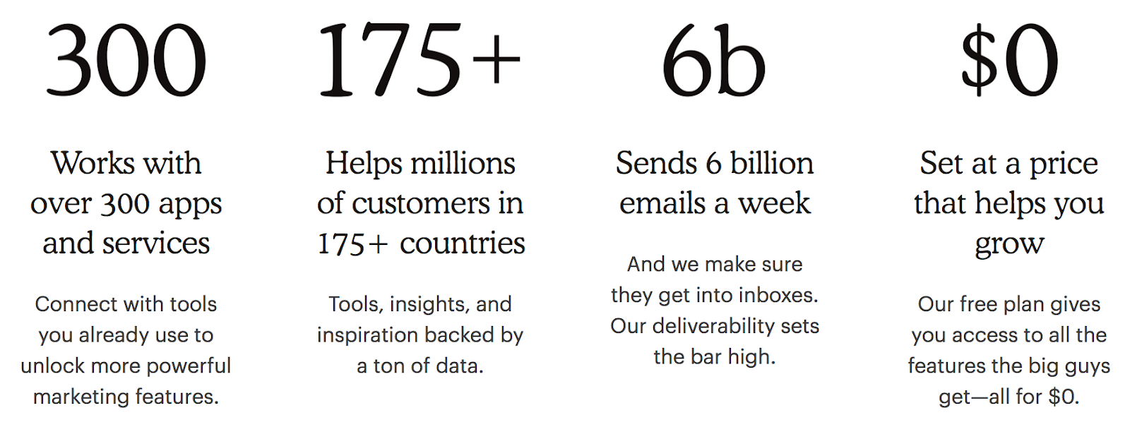
The work you do is humble but 2019 is the year to brag a little about all the hard work that has been accomplished in 2018! Look back on your successes and feature them in a creative way on your website and social media. Stats, when designed well, are one of the easiest and fastest ways to convey important information.
One of my favorite digital reports that comes out each year is MailChimp’s Annual Report. Not only do they never fail to amaze with design, but they pull out compelling numbers that resonate with readers. Designing an award-winning annual report is nice, but it certainly isn’t the highest priority for the organizations we work with. What you can do is pull some of your yearly numbers and display them in an attractive way on your site.

Build credibility by pulling out some numbers to illustrate your accomplishments. Here are a few ideas to get you started:
- Number of campaigns launched
- Number of people benefited
- Number of initiatives
- Number of countries impacted by your work
3. Make a move: try animation
Done are the days of static websites. Animation is the greatest visual tool to amplify what could be a well-designed site into an extraordinary site. Animation is becoming the norm and when we don’t see it, the lack of its presence is obvious. Users are now expecting things to move in both big and small ways (I’ll get more into the small ways later). Just like everything in web design, the movements must be thoughtful so as not to frustrate or confuse users. Animations should be thoughtfully included while keeping the integrity of a design system so it doesn’t look out of place or awkward.
Animation increases interactivity and strengthens your brand all in one swoop making it worth the effort that goes into it. Nielsen and Schneiderman have concluded that usability is made of five principles in which animation help to support:
- Learnability: animation can help a user to navigate an interface while offering visual prompts.
- Efficiency: animation can help a user get directives faster
- Memorability: animation can offer visual delight which is hard to forget
- Errors: when implemented properly, animation can help avoid user errors
- Satisfaction: animation is intrinsically satisfying because we humans like movement
4. Make us of microinteractions for maximum results
Microinteractions not only improve design, but also improve UX (when implemented correctly). They are the small movements we are increasingly seeing on websites and apps that provide small queues to:
- Direct the user
- Provide feedback to a single action
- Offer delight by making the overall experience more fun
- Communicate information visually without clutter
- Make interactions more human

Microinteractions should be so intuitive that the user doesn’t even notice it unless they’ve said to themselves, “gee, that was easy!” They are increasingly common because they are mobile friendly and save precious limited space available on a mobile screen; however, they can and should be used on your desktop version as well. They’ll level up your site and turn it from good to great.
The most common uses of microinteractions are:
- Data input: directs a user when entering information in a field without interrupting their task at hand
- Swipe: increases interactivity and eliminates tapping
- Call-to-action: subtlety directs a user to the intended action you want them to take
- Animated buttons: movement illustrates that the intended action has been accomplished
“Microinteractions are an exercise in restraint, in doing as much as possible with as little as possible. Embrace the constraints and focus your attention on doing one thing well. Mies van der Rohe’s mantra of “less is more” should be the microinteraction designer’s mantra as well.” ― Dan Saffer, author of Microinteractions: Full Color Edition: Designing with Details.
5. Prioritize accessibility
If you haven’t made your site accessible yet, 2019 is the time! I talk about accessibility a lot and how important it is for those with disabilities, including blindness and low vision, deafness and hearing loss, learning disabilities, cognitive limitations, limited movement, speech disabilities, photosensitivity and combinations of these. Over the past year, government organizations have worked to make their websites accessible according to AA standard by law, and now it’s time for everyone else to jump on board. Companies that aren’t, are starting to receive lawsuits for violating the Americans With Disabilities Act.
Companies such as Glossier, AllSaints, and Beecher’s Cheese were all hit with lawsuits in 2018. The laws are still murky when it comes to accessibility standards outside of government organizations but overall: (1) it’s not worth the risk, and (2) making your site accessible to all is only going to strengthen your organization overall.
These are the seven ways to make your site accessible:
- Add plenty of color contrast
- Make information understandable in more ways than just using color as the main indicator such as bolding or underlining text, or adding an icon
- Include focus states, for example if a menu item has been selected, include an underline as an indicator – this is particularly helpful for someone using a keyboard to navigate
- Ensure that form fields and inputs include labels or instructions (bonus points if you include a microinteration!)
- Include alt text for images and non-text content
- Include markup in your code for screen-readers
- Support keyboard navigation
6. Explore Augmented Reality (AR)
Welcome to the future! Augmented Reality is here. So how can you apply this technology to your mission-based organization? There is nothing offering a more immersive experience right now than AR as it is accessible to anyone with a mobile phone. We recently did some work with the Communications Network, and prototyped an AR experience to accompany their printed “Change Agent” magazine.
Our friends at the Smithsonian are using AR to bring exhibits to life. The immersive experience takes “interactivity” to a new level and you can use that to your advantage by making donors truly connect with your cause. Every experience is tailored for an organization, but hopefully these examples open your eyes to the possibilities.
7. Be deliberate: maintain your brand alignment
I mentioned earlier that Dropbox, Shopify, and eBay went through design refreshes this year; however, another thing they did in the process was to build out their design systems to improve scalability, maintain consistency, improve efficiency, and reinforce teamwork. I know I’ve already given you a few “must-do’s” for 2019, but this might be the single most important one to wrap it all together. Without a design system, things can quickly fall apart. But if you put some time into it, it will pay off big time in the long run. Most organizations with a brand guide already have at least a loose structure of a design system and, so it’s just a matter of filling in the missing pieces. Once all the pieces are established, you’ll end up with a series of reusable design components.
Some of the key components to a design system are:
- Typography
- Palette
- Photography style
- Call-outs
- Button styles
- Grid layout
Check out the Dropbox, Dunkin’, and Ebay design systems for an in-depth look and how they are being deliberate in the way that they maintain brand alignment.
A design system will also work towards the overall goals and messaging of an organization to further support your brand. Once a design system is solidified, the idea is that any designer at any time from any place in the world can refer to it and build something out that accurately and efficiently reflects the organization and brand. It’s the ultimate organizational tool for any digital presence, and who wouldn’t want to start 2019 out feeling utterly organized?!
I look forward to seeing how you approach design in 2019. Best of luck!