Blog Insights
Creating Logos With Meaning
Great logos stick in our minds forever. Just think about the Nike swoosh, the rainbow Apple, or the World Wildlife Fund’s Panda. To share a little secret about what makes great logos stand the test of time: they actually have a much deeper meaning baked into those “simple” visuals.
Think about the first time you saw the hidden forward arrow in the FedEx logo (we hope this wasn’t a major spoiler) The arrow is not only visually appealing, but it also achieves two important things:
 As a 73-year-old organization, the brand visuals and logo had to embody the rich history of the organization, while also positioning the brand for relevancy today and into the future. Their audiences are global and span many religions, so the visual treatment had to work well in this global context.
 Similar to the Atla project, PATH was in the position to strategically benefit from an updated logo. The new logo really embodies their core mission. Here’s what the designer had to say about developing the new PATH logo:
“At the heart of the brand is an idiosyncratic logo. Unlike any other health organization in the world, PATH works on all pieces of the global public health puzzle, so we underscored PATH’s bold name with a string of abstract and geometric shapes that represent the diverse and innovative methods PATH employs to address global health challenges. The logo triggers connotations of networks, partnerships, and initiatives working together for a common goal.”
Similar to the Atla project, PATH was in the position to strategically benefit from an updated logo. The new logo really embodies their core mission. Here’s what the designer had to say about developing the new PATH logo:
“At the heart of the brand is an idiosyncratic logo. Unlike any other health organization in the world, PATH works on all pieces of the global public health puzzle, so we underscored PATH’s bold name with a string of abstract and geometric shapes that represent the diverse and innovative methods PATH employs to address global health challenges. The logo triggers connotations of networks, partnerships, and initiatives working together for a common goal.”
 The meaning behind the bear is massively important in the history of the brand, so it made sense to be a leading part of the symbolism in the updated mark. The designer of the NRDC logo provides more insight into the meaning within this iconic logo:
“NRDC’s identity reflects strength, pride, and action. The bear, with head held high, confidently moves forward, while the shield represents strength and protection. The eight-pointed star mimics a compass and references the global aspirations of NRDC’s mission.”
The meaning behind the bear is massively important in the history of the brand, so it made sense to be a leading part of the symbolism in the updated mark. The designer of the NRDC logo provides more insight into the meaning within this iconic logo:
“NRDC’s identity reflects strength, pride, and action. The bear, with head held high, confidently moves forward, while the shield represents strength and protection. The eight-pointed star mimics a compass and references the global aspirations of NRDC’s mission.”
 The style of the pattern artwork immediately connects to the heritage of the awards, and at the same time alludes to a vibrant personality of an event-focused organization. The Tusk Conservation Awards logo designer talks about the importance of creating an emotional connection to the visuals:
“To create an emotional connection with Tusk’s roots, we looked into the cultural influences across the continent. Taking inspiration from tribal art, we designed a unique graphic pattern that encompasses the four letterforms of T-U-S-K in black, white and orange geometric shapes. The pattern echoes traditional African designs and informs the confident style of the brand that is ownable and celebratory in character.”
The style of the pattern artwork immediately connects to the heritage of the awards, and at the same time alludes to a vibrant personality of an event-focused organization. The Tusk Conservation Awards logo designer talks about the importance of creating an emotional connection to the visuals:
“To create an emotional connection with Tusk’s roots, we looked into the cultural influences across the continent. Taking inspiration from tribal art, we designed a unique graphic pattern that encompasses the four letterforms of T-U-S-K in black, white and orange geometric shapes. The pattern echoes traditional African designs and informs the confident style of the brand that is ownable and celebratory in character.”
 This logo is iconic and works with only one color. The orange color speaks to their classic reputation, established in 1965, and the mountain symbol was retained/updated to pay respect to the equity the original logo had in the outdoor leadership space. The NOLS logo designer talks about the meaning with this iconic logo:
“Our new look reflects both our new, signature color as well as the mindset of our graduates. The refreshed logo shows a two-peaked summit in front of a sunset, representing our philosophical ideals that real-life skills and knowledge are acquired through perseverance and overcoming adversity in the wilderness.”
My hope is that now you will start noticing more subtle themes in commercial and non-profit logos alike. It is fun to see discover new aspects to very familiar logos.
A logo redesign or refresh may not be in your immediate future, though don’t rule out the effectiveness of a well-designed and meaningful logo as the core of your brand system. Even if it does not make sense to tackle your organization’s logo, a conference or special initiative can be a great way to explore the meaningful logo process.
This logo is iconic and works with only one color. The orange color speaks to their classic reputation, established in 1965, and the mountain symbol was retained/updated to pay respect to the equity the original logo had in the outdoor leadership space. The NOLS logo designer talks about the meaning with this iconic logo:
“Our new look reflects both our new, signature color as well as the mindset of our graduates. The refreshed logo shows a two-peaked summit in front of a sunset, representing our philosophical ideals that real-life skills and knowledge are acquired through perseverance and overcoming adversity in the wilderness.”
My hope is that now you will start noticing more subtle themes in commercial and non-profit logos alike. It is fun to see discover new aspects to very familiar logos.
A logo redesign or refresh may not be in your immediate future, though don’t rule out the effectiveness of a well-designed and meaningful logo as the core of your brand system. Even if it does not make sense to tackle your organization’s logo, a conference or special initiative can be a great way to explore the meaningful logo process.
- It creates an “Aha!” moment for a person when they see it, which further seals the brand in their memory.
- It uses visual layering to reinforce the organization’s core mission and big idea.
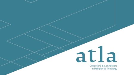
Case study: Atla
A great example of this is Atla, a membership organization promoting worldwide scholarly communication in religion and theology by advancing the work of libraries and related information providers. We partnered with Atla on a comprehensive global rebrand that launched earlier this year. This is a great example we featured in a previous blog post of a comprehensive and strategic rebrand, though in this blog post I want to focus exclusively on how we built meaning into their new wordmark logo. This example represents things to ask yourself as you consider embarking on a logo redesign or refresh.
As a 73-year-old organization, the brand visuals and logo had to embody the rich history of the organization, while also positioning the brand for relevancy today and into the future. Their audiences are global and span many religions, so the visual treatment had to work well in this global context.
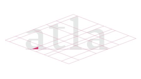
Capturing the rich history
Starting with a serif font was an important part of achieving this requirement. The tone of the logo embodies refinement, purpose, and sophistication. The logo letters are custom-designed for Atla, featuring exact angles from their connection grid, a visual system of angles, horizontal and vertical lines. We created the connection grid to build meaning into the logo and throughout their entire brand visual system. The connection grid is used throughout the brand expressions to nod to these core aspects.
Communicating Atla’s purpose
Two consistent themes from our audience perception research set the basis for the final tagline: Collectors & Connectors in Religion and Theology. Atla’s engagement across audiences seemed connected to a key theme–connecting people with other people, ideas, resources, etc. Also, at its core form, everyone saw Atla as the collector of these ideas. These themes not only shaped the tagline, they drove our logo sketches, exploring how the typographic forms could connect and interact to make shapes that felt collaborative.Creating a modern, timeless logo
The angled connection grid was used to create new letterforms to create the logo that strikes this balance of classic and modern, old and new, technical and artistic. The connection grid is used throughout the entire brand system to define supporting shapes in sub-logos and in designs, define layouts, and shape the content experience on the website. The second most important part of the process was focusing on the new tagline that we had worked with Atla to create. Learn more about their tagline and Atla’s comprehensive rebrand.Four great nonprofit logos
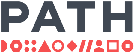
The following four nonprofit logos are great examples of brands that took a deliberate approach to how their logo would represent and communicate their mission.Program for Appropriate Technology in Health (PATH)
Similar to the Atla project, PATH was in the position to strategically benefit from an updated logo. The new logo really embodies their core mission. Here’s what the designer had to say about developing the new PATH logo:
“At the heart of the brand is an idiosyncratic logo. Unlike any other health organization in the world, PATH works on all pieces of the global public health puzzle, so we underscored PATH’s bold name with a string of abstract and geometric shapes that represent the diverse and innovative methods PATH employs to address global health challenges. The logo triggers connotations of networks, partnerships, and initiatives working together for a common goal.”
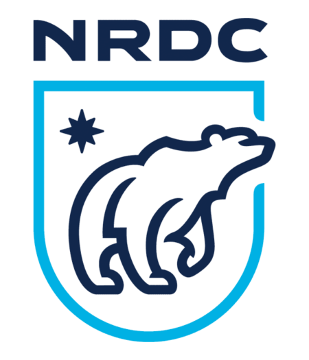
Natural Resources Defense Council (NRDC)
The meaning behind the bear is massively important in the history of the brand, so it made sense to be a leading part of the symbolism in the updated mark. The designer of the NRDC logo provides more insight into the meaning within this iconic logo:
“NRDC’s identity reflects strength, pride, and action. The bear, with head held high, confidently moves forward, while the shield represents strength and protection. The eight-pointed star mimics a compass and references the global aspirations of NRDC’s mission.”
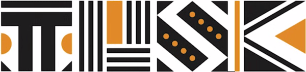
Tusk Conservation Awards (Tusk)
The style of the pattern artwork immediately connects to the heritage of the awards, and at the same time alludes to a vibrant personality of an event-focused organization. The Tusk Conservation Awards logo designer talks about the importance of creating an emotional connection to the visuals:
“To create an emotional connection with Tusk’s roots, we looked into the cultural influences across the continent. Taking inspiration from tribal art, we designed a unique graphic pattern that encompasses the four letterforms of T-U-S-K in black, white and orange geometric shapes. The pattern echoes traditional African designs and informs the confident style of the brand that is ownable and celebratory in character.”
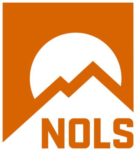
National Outdoor Leadership School (NOLS)
This logo is iconic and works with only one color. The orange color speaks to their classic reputation, established in 1965, and the mountain symbol was retained/updated to pay respect to the equity the original logo had in the outdoor leadership space. The NOLS logo designer talks about the meaning with this iconic logo:
“Our new look reflects both our new, signature color as well as the mindset of our graduates. The refreshed logo shows a two-peaked summit in front of a sunset, representing our philosophical ideals that real-life skills and knowledge are acquired through perseverance and overcoming adversity in the wilderness.”
My hope is that now you will start noticing more subtle themes in commercial and non-profit logos alike. It is fun to see discover new aspects to very familiar logos.
A logo redesign or refresh may not be in your immediate future, though don’t rule out the effectiveness of a well-designed and meaningful logo as the core of your brand system. Even if it does not make sense to tackle your organization’s logo, a conference or special initiative can be a great way to explore the meaningful logo process.