Blog Insights
10 Things I Hate About Web Design
Having a website can accomplish a multitude of benefits for your organization, whether that’s to elevate your brand presence, increase awareness for social issues, or raise donations. There are hundreds of thousands of organizations that do meaningful work, which means yours need to stand out to be noticed.
For many organizations the ultimate goal is to gain volunteers or raise donations, but before that can happen, trust needs to be gained. When it comes to your website, design is extremely important in shaping how users see you as a trustworthy brand and source of information. There are a number of easily-solvable blunders that websites engage in every day that can damage that trust. Let’s go through the top ten on my hate list.
1. I hate unclear hierarchy
The single most important design rule is hierarchy. It doesn’t matter if it’s web or print, a billboard or a dinner menu. Hierarchy should be the framework of what is being designed. Your organization needs to agree on what is the most important, least important, and everything in between. The designer can then process that information visually.
“Design is the conscious effort to impose a meaningful order.” ~ Victor Papanek
Use hierarchy as one of your most powerful and most easily-implementable design solutions. Headers should be bigger or bolder and therefore more impactful, buttons should stand out, and important images and text should be given more surrounding space. Once you’ve got that baseline, everything else can be structured with it in mind. If implemented well, it will give your users the visual keys they need to absorb your content in the order of importance you’ve set out for them.
2. I hate websites that aren’t accessible
There’s a lot of good design out there but what stands out as great design is in its accessibility to everyone. Breaking accessibility standards, also known as inclusive design, greatly reduces your web visibility for people with disabilities, including blindness and low vision, deafness and hearing loss, learning disabilities, cognitive limitations, limited movement, speech disabilities, photosensitivity and combinations of these. I trust that an organization wouldn’t knowingly agree that individuals with vision impairments are less important than those without, but to break AA guidelines is essentially doing just that. I’ve seen websites that I’d consider a true work of art, but if people can’t actually read what is on the screen, then what’s the point?
“People ignore design that ignores people.” ~ Frank Chimero
There are steps to take in order to make a website accessible and machine readable; however, it’s the web designer’s job to make sure the site is visually accessible. The biggest visual component of accessibility is making sure there is enough color contrast. If white text on pastel green is difficult for a person with normal (20/20) visual acuity to read, then it will be close to impossible for someone with sight impairments to view.
There are handy tools like Accessible Colors that allow you to plug in hex codes to learn whether or not colors pass accessibility standards.
To learn more, check out this fully-accessible 508 compliant design presentation on why accessibility matters and what you need to consider when designing for it.
3. I hate inconsistent design systems
Featuring call-to-action buttons in more than one color across a website (i.e, a green button in the middle of the page, with an orange button at the bottom) is generally understood to be confusing for users, yet it’s still happening on so many websites. Consistency is key when it comes to a design system because ultimately it helps the user navigate through a site and digest information better. This can also extend to other digital assets, such as your newsletter, so that your users recognize your design cues and transition to your website easily.
Consistent design makes for intuitive design which helps people know what to do. The best part about consistent design is that it’s not just better for the user, but better for everyone involved in a project! If design updates are needed, a consistent design system makes changes much easier to implement which can ultimately save time and money.
“Design is a plan for arranging elements in such a way as best to accomplish a particular purpose.” ~ Charles Eames
A few design elements that should always remain consistent include:
- Link styles
- Headers
- Button styles
- Alert messages and icons
- Color palettes
- Typography
To learn more, read this great breakdown of what design systems are and why they are so incredibly important.
4. I hate unclear calls to action
An alert message + an email signup pop-up + a carousel + several buttons = user paralysis. If you give people too many options, they’ll ultimately choose the least desired action, which is to leave your site altogether. Keep things simple: do one thing at a time and allow people to process information and hopefully take the main call to action you’ve set out for them.
Users are increasingly treating a homepage as a navigational tool to get them to the actual content they want to see. If there is a clear journey, people will find the content they want more easily than being bombarded with everything all at once. Decide on one or two calls to action and allow the design to focus on obtaining those desired results. If there are multiple calls to action, size and weight of buttons and fonts can help determine the hierarchy of importance.
5. I hate overcrowding and lack of white space
Fear not the white space! People’s brains need time to process the content you’re putting in front of them — so don’t try to fill every single pixel of space on the screen. When organizations are thinking about their homepage content, it is often perceived as such valuable real estate that it leads to information crowding. Imagine entering a museum with ten of the greatest artists who have ever lived, and their best works all nailed to the same one wall. How can you fully engage and appreciated each piece? Bombarding your visitors with all the most important pieces right away makes it harder for them to know what to click on first/next, or follow the journeys and calls to action you’d like them to take.
“Truly elegant design incorporates top-notch functionality into a simple, uncluttered form.” ~ David Lewis
So when it comes to designing your website, give both your content and your visuals room to breathe! Give your users the space they need to read your content and engage with your visuals before offering more information.
6. I hate hard-to-read fonts
A website might tell us the meaning of life, but if the font is completely unreadable or even partially difficult to follow, people won’t stick around for the answer to what is the ultimate age-old question. Don’t make people work harder than they need to for the information you want them to have!
We all want a unique site that stands out, but there is a reason Times New Roman and Helvetica are classic fonts; they are among the easiest to read both in print and on the web. There are some great fonts out there these days with personality and readability. Choose one that strikes a good balance between the two. Headers offer an opportunity to pick something unique, but sticking to something simple for your body content is best to ensure it will be readable on all platforms.
7. I hate generic icons
To be fair icons are really, really tricky. An icon needs to be simple yet often has to convey a complicated message, and sometimes those complexities don’t translate into an icon. Icons are so prevalent on the web that there is unspoken pressure to include icons on every website, even if it doesn’t actually mean anything. The real question to ask is, “are my icons enhancing the user experience or hurting it?” We’ve all seen icons next to seemingly-unrelated text, leaving us confused and wondering what the connection is.
Worse than generic icons are misleading icons. There is a universal language that icons convey. The “share” icon is a common example. It’s an unspoken rule that there will be some type of interaction in which the user can share the link or article.

When a design uses the “share” icon with no interaction it can result in a frustrated user who was expecting a certain action to take place. A good rule of thumb is if icons lack meaning, ditch the idea or get custom illustration that can more intricately convey complexities.
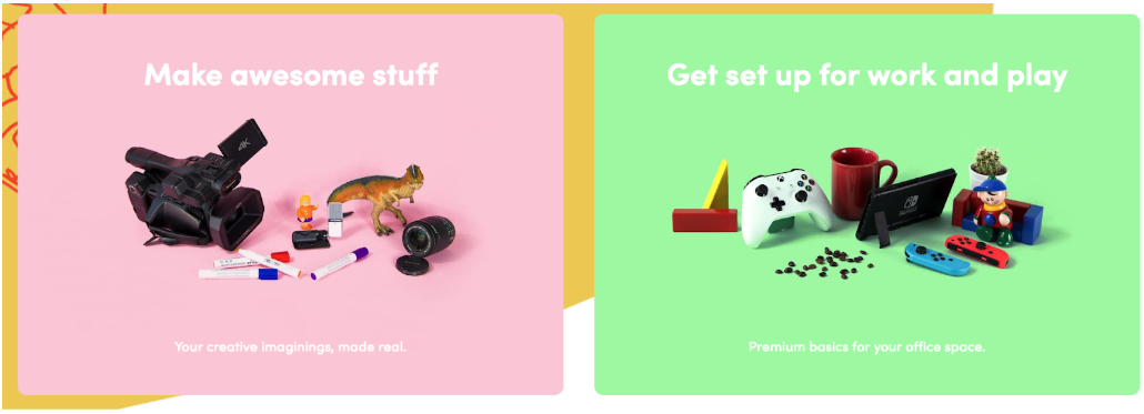
8. I hate bad stock photography (and let’s be honest, most of it is)
As with icons, poorly-chosen images can leave people confused as to the connection between the image and how it relates to the content. A hero is the first impression you get to make on a new user that lands on your site, yet often the image selection can leave people baffled. “Who is this site for?”, “What do they do?”, “How do they want me to feel?” The right image will answer all those questions, at least on a superficial level.

“It’s art if can’t be explained. It’s fashion if no one asks for an explanation. It’s design if it doesn’t need explanation.” ~ Wouter Stokkel
Professional photography can be pricey but from a design perspective it’s well worth the cost. Professional photography sets you apart because you can customize the subject matter to your precise need, helping to reinforce your brand and message. Since professional photography is not in everyone’s budget here are a few tips for picking out good stock:
- Avoid exaggerated facial expressions. It comes across as cheesy and screams “STOCK”!
- Find a diverse mix of people. A lot of the models look the same, so take time to dig through to make sure the images you select are inclusive to all your audiences.
- Keep image styles consistent. Some stock photos have rustic looking filters, some are bright and vibrant, while others have flat, solid backgrounds. Keeping all your images in the same style family is going to give a more cohesive look so if you pick something with a rustic filter, all your images should have a rustic filter.
- Take advantage of a free Canva account. If your budget is tight, a great option is Canva, which offers its premium version free to registered nonprofits. Hurray!
9. I hate distracting carousels
The infamous carousel (i.e., the functionality that allows for multiple images or clips to automatically rotate on your site) is a source of endless debate. However, the facts don’t lie: it is simply not an effective way to communicate. NNGroup found that carousel information gets lost or ignored by users. Additional negative implications include low-literacy users and non-native speakers not having enough time to read auto-rotated content, and users automatically assuming that it’s an advertisement. And those are just a couple of examples.
While it’s best practice to avoid carousels altogether, if it’s simply too tempting for you to avoid, a “less bad” option is to place the carousel farther down the page as a way to feature highlighted content or a photo gallery. Why? Your hero space is the one opportunity you have to make an impression on a user and that impression is lost if the message keeps changing. Also, if you do include a carousel lower on a page, I would suggest to not use the auto-rotate option. Give your users control over how, and at what pace, they process the information you’re presenting to them.
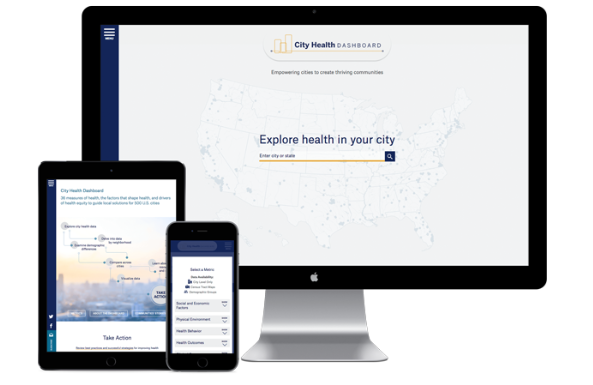
10. I hate non-responsive websites
It’s 2018 and frankly every website should be responsive. Users are 5x more likely to leave a site that is not mobile friendly, according to Google Small Business. No one wants to pull up a site on their phone and have to resize the browser in order to read the content. Much of the process of making a site responsive relies on front end development, but this doesn’t mean design is off the hook. It is wise to work in tandem with your design and UX team to make sure the site is being translated properly on all devices.
Now that you’ve gotten through the 10 Things I Hate About Web Design it’s time to do the exact opposite! While I’ve listed bad practices above, I hope that my suggestions on how to counteract each one guide you in a better direction. Go forth, and design well!